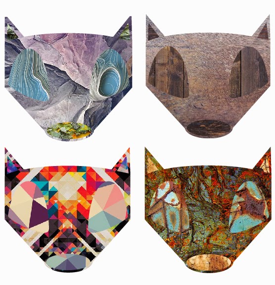
Like the pathway stage this brief is very much an experimental way into graphical techniques, such as: Line, Tone, Value, Depth, Shape, Texture, Colour and Space. The main reason for this is to acquire a bunch more skills which we can then further dive into when given more specific briefs.
For the first part of this lesson I was given the task for going into Illustrator, which I had near to no knowledge of bar making typography pieces. With that I was told to use just the basic shapes to create very simple animals, which I would then be adding textures to in layers to give off different interesting effects.

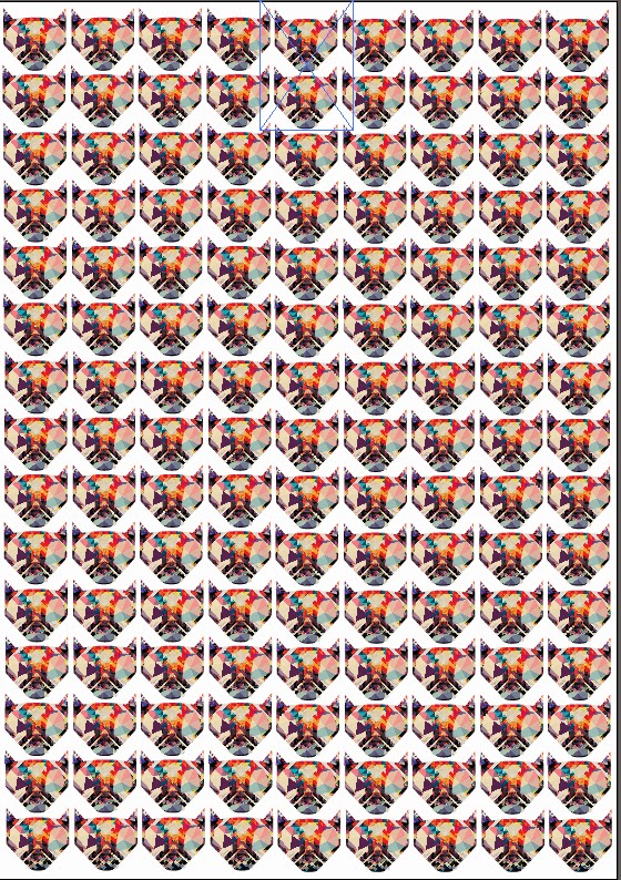
With that in mind, for the foxes I decided to use related textures on the same piece. This worked well as using rock, wood, rust and hyper detailed textures on the same piece turned out rather well. I think my favourite piece is the rust textures. As these 3 different textures contrast really well with one another. I also like the hyper detailed one as the colours are so in your face it makes the fox head look even more interesting. Because of that I decided to down scale that piece and repeat it over an A4 size page to create a pattern.
 I think this turned out really nicely and makes me think of other ways in which these designs could be used. If I made say a deer or a Robin the design could easily be used for Christmas cards. Or going along with the current designs, stickers, pins or even logos. There are so many different uses for these quick little designs.
Lastly I wanted to take my fox design one step further and give the poor fella a body to go along with his majestic head. Looking back at this piece now I wish I either made the body more pointy like the head, or made the head more pointy to go with the softer rounded body. However after completing the outline in Illustrator I then came up with the not so original idea of a 'fire fox' and as such only used fire and light textures to finish him off.
I really like the effect this gives off and I will be going back at some point to create a more rounded off fox before adding texture to give a more finished feel to the piece. I would normally use photoshop for this sort of piece but the more I use Illustrator I feel the more I will end up coming around to it.


No comments:
Post a Comment