Showing posts with label Illustrator. Show all posts

Thursday, 4 February 2016

Editorial Design

For this brief I was tasked with designing a 16 page documents showcasing different forms of design from pc to mobile and print. This would include a Double page spread, a responsive design mock up, a storyboard as well as a set of scrolling device designs.

Follow Harry's board Swiss Design on Pinterest.

During the first week of this brief I set to work researching what was already out their and getting my head around the layouts off different mediums that were used. Such as how newspapers layout their stories but then how the same story was shown on their own website.

Follow Harry's board Publication / Layout on Pinterest.

Following this the next week I started to jot down my different ideas and working them out. As such taking some of the ideas into photoshop and illustrator to work with them. This including doing some photo manipulation to see if I could craft something from photos already out their and also to creating my own images from scratch such as tennis and baseball pitches.


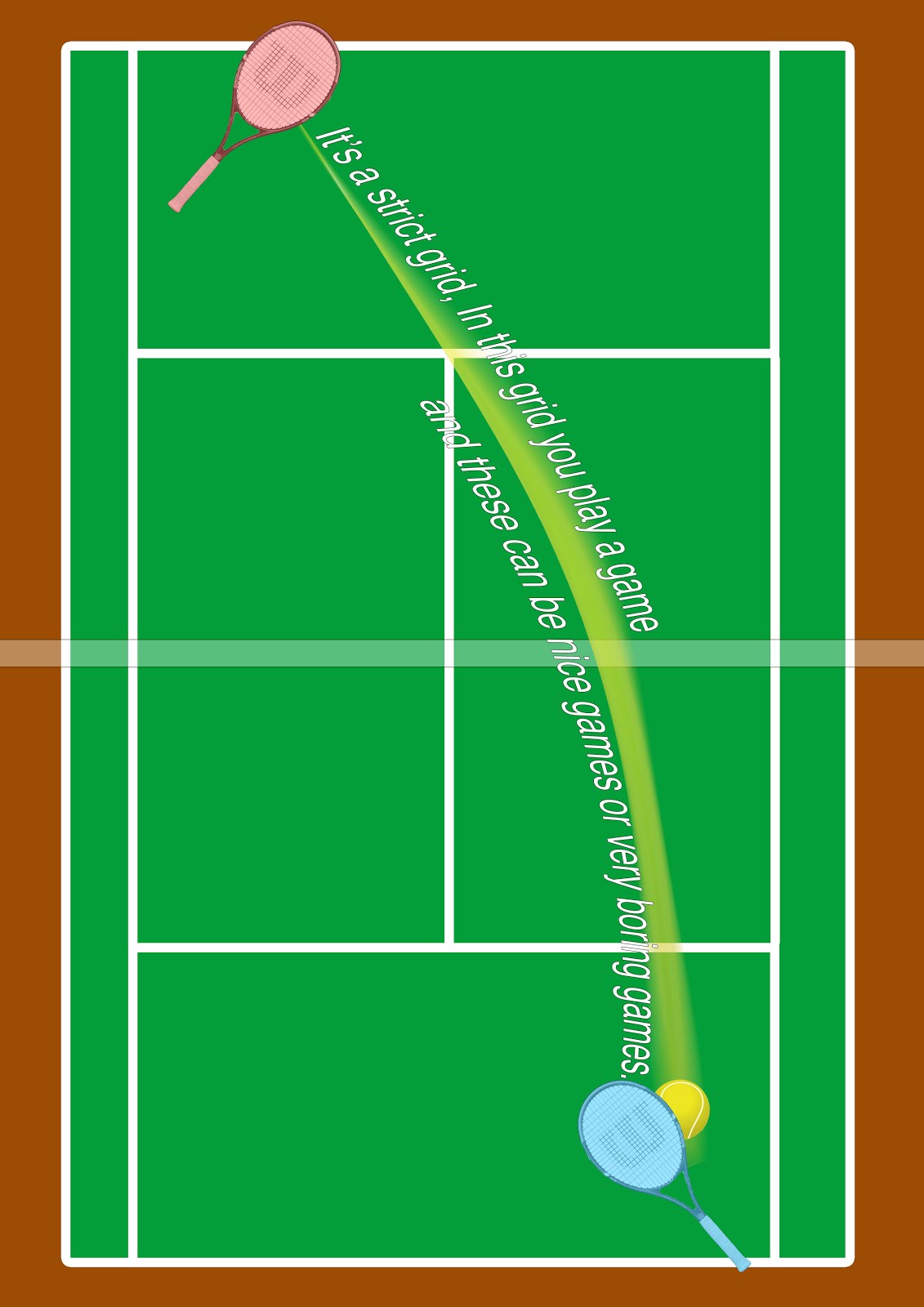
With the main focus being on a sport I went with tennis as I had a firm grasp on the rules and environment which made the ideas much easier to work with.

Double Page Spread:


Scrolling Devices:


Responsive Design:


Storyboard:


Reflection:


I enjoyed making this multipage document, I found working on my own little zine to be really interesting and engaging especially when I started to do a side project away from this using my own photos and working them into play.
As for this piece based on swiss design, I found the overall completion okay. I wish I had more time and ideas around the sports based medium in which I had to design with. Due to this I feel my design work in Illustator and photoshop fell a little flat, as I don’t think I was doing the Swiss Design justice as I could tear into the stripping away of elements of the game of tennis without losing the sense that it was still tennis being represented.  However I feel the storyboard and horizontal scrolling devise do really work with this style, I just wish that idea could have been seen throughout all of my designs. Given another chance I’d like to try more type styled designs and move away from the over thinking of the game I was working with.


Monday, 1 February 2016

Logo illustrator Experiments


Using basic colours and gradients I was able to get a strong contrasting effect. While multiplying the forms and shapes it gave some really cool designs.

Tuesday, 10 February 2015

Graphics: Illustrator shoes.

Carrying on with my elements of design brief and still working in Illustrator my next task was to research Sarah Beetsons work and bring in an object to draw in Illustrator. Since I was looking into Sarah Beetsons work it only seemed right to take her work with shoes and draw my own shoe.
What I enjoyed most about her work is the very clear clean lines with a nice 60's feel as of the bright use of vibrant colours.


So before even looking into Illustrator I took a photo of my subject so I had a static image I could look at and draw from since I wanted the image to have a 2D feel to it since I planned to use just lines to make up the basic shape.


Taking the photograph into Illustrator I used it as a template to create my basic shape for the shoe as seen above. I did this by drawing sections at a time on different layers using the pen tool as the node feature allows for easy shaping and corrections to the base drawing. After I had the basic shape down after alot of small fixes to make sure certain sections didn't over lap (which would be more noticeable when colours added) My next step was to add stitch lines and air holes to the main shoe and use the same technique of adding line spacing to my base line from the pen tool to give off the grip texture on the front of the shoe. I feel this really brings the shoe to live. The extra detail such as that and the shoe lacing eyes really make this piece jump out I feel.

 The next step was to add colours to each shape. Doing this allowed me to focus on any missed imperfections I may have over looked in the original line work. 
With a focus on colour and clean design I ended up making a sleek red and blue/purple shoe after such went for a more unique colour scheme looking back at Sarah Beetsons work again for guidance. After finalising the 4 pieces I added some tonal colour as backgrounds to help the final pieces pop off the page. I feel this worked really well with what I was aiming for.


Sunday, 7 December 2014

Graphics: Illustrator

Having completed my pathway stage, I decided to specialise into Graphics, this was largely down to the fact it was the pathway I enjoyed the most and was the area where i wanted to learn more. Having specialised I was then given my first brief 'Elements of Design'.
Like the pathway stage this brief is very much an experimental way into graphical techniques, such as: Line, Tone, Value, Depth, Shape, Texture, Colour and Space. The main reason for this is to acquire a bunch more skills which we can then further dive into when given more specific briefs.

For the first part of this lesson I was given the task for going into Illustrator, which I had near to no knowledge of bar making typography pieces. With that I was told to use just the basic shapes to create very simple animals, which I would then be adding textures to in layers to give off different interesting effects. 


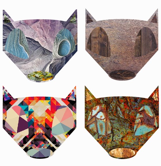
Having got my basic shapes down I then took my Panda head and fox head that I made and started to add textures I found online to these shapes. First I went for a monotone type effect for the panda heads sticking to there original colours. However I'm not really sure I chose decent textures which work together as they're very detailed textures and as such clash.
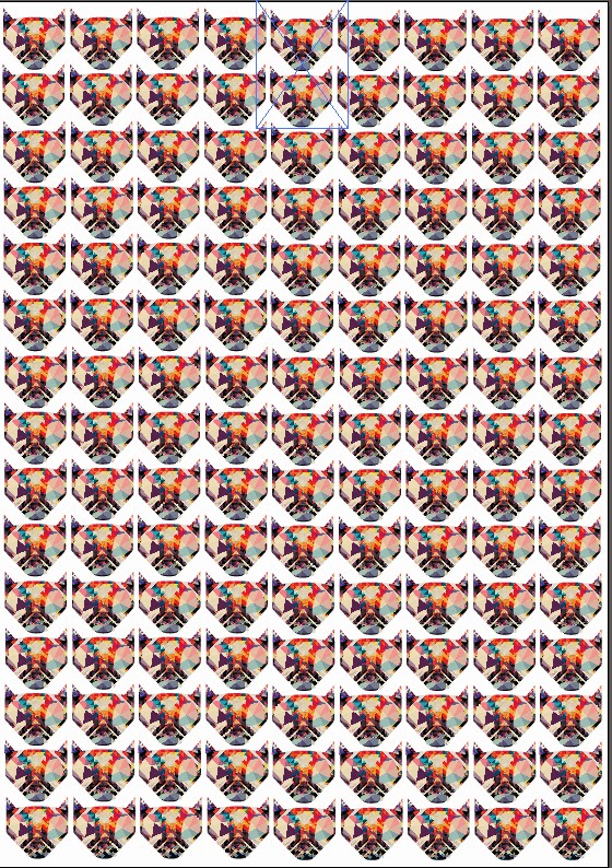
With that in mind, for the foxes I decided to use related textures on the same piece. This worked well as using rock, wood, rust and hyper detailed textures on the same piece turned out rather well. I think my favourite piece is the rust textures. As these 3 different textures contrast really well with one another. I also like the hyper detailed one as the colours are so in your face it makes the fox head look even more interesting. Because of that I decided to down scale that piece and repeat it over an A4 size page to create a pattern.

I think this turned out really nicely and makes me think of other ways in which these designs could be used. If I made say a deer or a Robin the design could easily be used for Christmas cards. Or going along with the current designs, stickers, pins or even logos. There are so many different uses for these quick little designs.


Lastly I wanted to take my fox design one step further and give the poor fella a body to go along with his majestic head. Looking back at this piece now I wish I either made the body more pointy like the head, or made the head more pointy to go with the softer rounded body. However after completing the outline in Illustrator I then came up with the not so original idea of a 'fire fox' and as such only used fire and light textures to finish him off.
I really like the effect this gives off and I will be going back at some point to create a more rounded off fox before adding texture to give a more finished feel to the piece. I would normally use photoshop for this sort of piece but the more I use Illustrator I feel the more I will end up coming around to it.


Friday, 3 October 2014

Creative Typography - Layered Photoshop Final Piece

Carrying on with my creative typography work in graphics after working in Photoshop and Illustrator, the next thing I was assigned to do, was to produce a layered image in Photoshop which reflected my chosen cliche: 'Honesty is the Best Policy'.
 
First before even looking online for photos, textures or any of that I jumped straight into my sketchbook and quickly sketched out with pins & markers a few test placements for what sort of image placement and text placement i wanted to work with. As I knew straight away I wanted to use the human form in some way with the text from my previous experimentation's in Illustrator/Photoshop.  


So after a quick plan I went online and I found a free high resolution image from the internet. In this instance I didn't want to have just some generic photo for my cliche of people just talking or someone being honest. I wanted to dive deeper into the meaning of the phrase as I've been doing with all the work. So I searched for someone who was distressed or looking down, as if they had been lied to or something dishonest had happened to them as I feel thats the true meaning behind the phrase. Even though Honesty is the Best Policy people still tell white lies or small half truths which spiral out of control. So I went on a search through www.freeimages.com and after finding a male [http://www.freeimages.com/photo/653183] and female [http://www.freeimages.com/photo/1044602] which i think both would work, i went on the search for a good texture that would work. Since I was thinking of human nature and how my cliche is very much part of human nature, lying and telling the truth etc it made sense to me on some level to use some sort of naturist texture such as trees, leave etc. After searching on www.lostandtaken.com i came across just what I was looking for [http://lostandtaken.com/blog/2013/9/10/giveaway-three-joomla-templates-from-templatemonstercom.html]. After a LONG wait for the college internet to download the high res wood and tree texture pack I started to edit away on Photoshop. 

 The first layered image i created considered of the male photo I found looking down or lost in this own thoughts. I didn't touch the image at all, however I did add a tree texture next. I chose a neutral coloured texture so its mainly just stripped back bark and I add a colour burn effect to it to help bring out the colour of that layer and changed the opacity to let the original photo pop through. At this stage I really liked the photos but next i faced my biggest problem and that being adding my cliche. I wanted to use my original cutout Photoshop piece of the cliche 'Honesty...' However i faced the problem that the colours were to vibrate and stood out for this piece so to try and counteract this I add effects. The main one being I changed the hue and saturation of the whole piece to a more rounded orange to bring up the dull colours and down the strong vibrate colours. This helped a little but not completely so I brought down the the opacity and got to the final piece above.
The only thing that I feel brings this layered image down is the cliche but that is down to the colours I chose in the original edit of letter. If I were to use this method again I'd make sure to choose and stick to a colour scheme from the very beginning or go crazy and have each one different.  


The second image works alot better I feel. This one is of the female image being suffocated and with that image I left it as it was off the website again like I did with the first one. Once again I added a tree bark texture but this time with the bark not stripped and added the colour burn again which with an opacity change really let the image below pop out and in this case it almost looks like the suffocating girl is trying to emerge from a trapping force or lie.
Lastly I went into Illustrator and quickly wrote up the cliche and added a brush stroke to it giving it a very rough feel which in my mind works very well with this piece and gives a final feel of it popping off the page but also falling back with an opacity change.
Out of the two layered images I created, and looking back at them both now. It is clear to me the second piece is mainly better than the first. This comes down to the use of text and how its not so abrupt and in your face which may have worked if I used an extremely striking photo but I was aiming for the more thought out approach where the viewer would have to think about this piece and the reasoning behind it. Such as why is the girl being suffocated by something and trying to break through this bark like wall.
Overall I like both these pieces and have learnt a great many things and can't wait to keep experimenting in Photoshop and creating unique and thought provoking pieces.