Showing posts with label Access to HE. Show all posts

Saturday, 11 October 2014

Fashion Illustrations Developed

Having tried my hand at fashion sketches  I wanted to take my Ideas a little further along the route of fashion Illustrations, primarily down a digital aspect. So to start off I found a free image online and imported it into Photoshop and went to work adding in one of my prints which I photographed from my print work. From this point it was very much a lot of careful use of the lasso tool to select around the suit my male figure was wearing, after that inverting the selection and deleting away the excess from my printed images. I did this with 2 different prints which can be seen below.

                      
After completing these 2 styles, which I really liked the way they turned out. I decided I should take it one step further and instead of using 1 pattern. I decided on using 3 different patterns together. One for the jacket, one for the pants and one for the tie. So i set out to work in the same manner as the first two, lasso the sections I wanted to have the pattern then inverting and deleting the excess. Until I had a fine piece I really liked.


Unlike with the first two I feel this one looks a lot more complete for a fashion Illustration. As the different patterns for each section of clothing really helps pull the whole thing together. But as well as that I add subtle gradients to each piece of clothing the give the cut prints there own unique light source. As in the original photo I had the light source was coming from the bottom right so for the jacket i did the same thing, arching the light from the bottom right of the jacket, and then darkening on the top left to help bring back the original lighting in the photo. For the pants I did the same but I also added a 2nd layer in the top half of the pants to give a shadow effect from the jacket being over the top of them. Lastly for the tie I just added a single from top to bottom gradient, the top being the darker as when comparing it to the bottom right original light source it stood out more from jacket so I went with that.
Overall I am really happy with the way this piece turned out, as I really enjoying working in Photoshop. Even more so when I get to incorporate original techniques such as the hand made prints from a handmade print block and get to manipulate them further in a program like Photoshop. This is something I love to do and plan to take the print method I learnt here further in some of my future work.

Friday, 3 October 2014

Creative Typography - Layered Photoshop Final Piece

Carrying on with my creative typography work in graphics after working in Photoshop and Illustrator, the next thing I was assigned to do, was to produce a layered image in Photoshop which reflected my chosen cliche: 'Honesty is the Best Policy'.
 
First before even looking online for photos, textures or any of that I jumped straight into my sketchbook and quickly sketched out with pins & markers a few test placements for what sort of image placement and text placement i wanted to work with. As I knew straight away I wanted to use the human form in some way with the text from my previous experimentation's in Illustrator/Photoshop.  


So after a quick plan I went online and I found a free high resolution image from the internet. In this instance I didn't want to have just some generic photo for my cliche of people just talking or someone being honest. I wanted to dive deeper into the meaning of the phrase as I've been doing with all the work. So I searched for someone who was distressed or looking down, as if they had been lied to or something dishonest had happened to them as I feel thats the true meaning behind the phrase. Even though Honesty is the Best Policy people still tell white lies or small half truths which spiral out of control. So I went on a search through www.freeimages.com and after finding a male [http://www.freeimages.com/photo/653183] and female [http://www.freeimages.com/photo/1044602] which i think both would work, i went on the search for a good texture that would work. Since I was thinking of human nature and how my cliche is very much part of human nature, lying and telling the truth etc it made sense to me on some level to use some sort of naturist texture such as trees, leave etc. After searching on www.lostandtaken.com i came across just what I was looking for [http://lostandtaken.com/blog/2013/9/10/giveaway-three-joomla-templates-from-templatemonstercom.html]. After a LONG wait for the college internet to download the high res wood and tree texture pack I started to edit away on Photoshop. 

 The first layered image i created considered of the male photo I found looking down or lost in this own thoughts. I didn't touch the image at all, however I did add a tree texture next. I chose a neutral coloured texture so its mainly just stripped back bark and I add a colour burn effect to it to help bring out the colour of that layer and changed the opacity to let the original photo pop through. At this stage I really liked the photos but next i faced my biggest problem and that being adding my cliche. I wanted to use my original cutout Photoshop piece of the cliche 'Honesty...' However i faced the problem that the colours were to vibrate and stood out for this piece so to try and counteract this I add effects. The main one being I changed the hue and saturation of the whole piece to a more rounded orange to bring up the dull colours and down the strong vibrate colours. This helped a little but not completely so I brought down the the opacity and got to the final piece above.
The only thing that I feel brings this layered image down is the cliche but that is down to the colours I chose in the original edit of letter. If I were to use this method again I'd make sure to choose and stick to a colour scheme from the very beginning or go crazy and have each one different.  


The second image works alot better I feel. This one is of the female image being suffocated and with that image I left it as it was off the website again like I did with the first one. Once again I added a tree bark texture but this time with the bark not stripped and added the colour burn again which with an opacity change really let the image below pop out and in this case it almost looks like the suffocating girl is trying to emerge from a trapping force or lie.
Lastly I went into Illustrator and quickly wrote up the cliche and added a brush stroke to it giving it a very rough feel which in my mind works very well with this piece and gives a final feel of it popping off the page but also falling back with an opacity change.
Out of the two layered images I created, and looking back at them both now. It is clear to me the second piece is mainly better than the first. This comes down to the use of text and how its not so abrupt and in your face which may have worked if I used an extremely striking photo but I was aiming for the more thought out approach where the viewer would have to think about this piece and the reasoning behind it. Such as why is the girl being suffocated by something and trying to break through this bark like wall.
Overall I like both these pieces and have learnt a great many things and can't wait to keep experimenting in Photoshop and creating unique and thought provoking pieces. 

Wednesday, 24 September 2014

Creative Typography [Final A-Z Pieces]

Following on from my previous creative typography post, After a lot of editing and correcting a few minor images i wanted to tweak i have complied all A-Z images. This includes my original photos, my threshold [black & white] edits and my 'Cutout / Stencil styled' edits.


Original Photos - A - Z [No edit - Straight out of camera]


Threshold Edits - A - Z


Cutout Filter / Stencil Styled Edit - A - Z

I really enjoyed the whole process of manipulations my originals photos to get to a point of having my own alphabet in photoshop. The threshold edits were nice to do but overall i feel they don't have the same sort of impact as the cutout filter edits. I think this may be because i prefer the way you can change the colour to very vibrant and eye catching colours where as the threshold just gives a very flat feeling to the photos.
What I enjoy most about the Cutout edits, is the way the original letter shapes are completely warped and simplified. Making some letters such as C, E, L lose all form and give the use of the alphabet to create a word or phrase a really interesting aspect, which is something that will be explored at a later date using cliches phrases and sayings.

Friday, 19 September 2014

Ink & Charcoal - The mess continues..

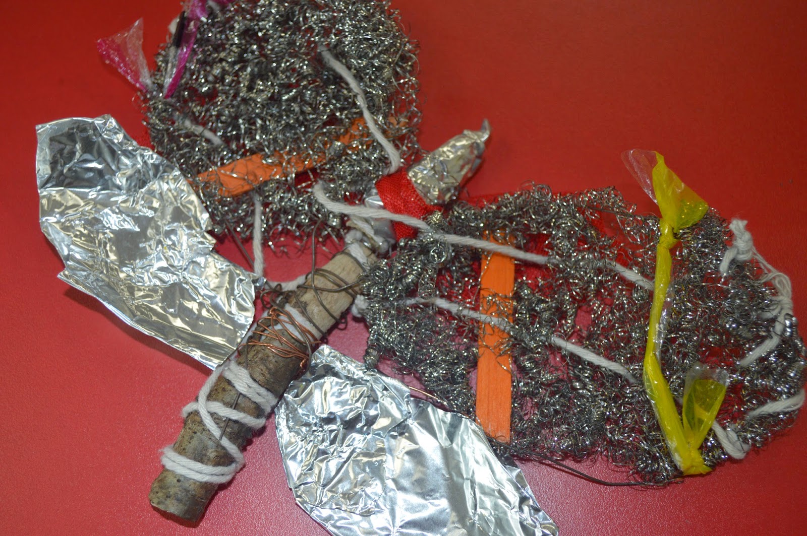
Following the previous day and making a 3D model of an insect i drew [Links in previous post] The next thing I did was to experiment with Charcoal and boy did it get messy. The plan was to focus closely on a small part of our models [Mine being a moth] and blowing it up on an A2 piece of brown paper. We were given 30 minutes of each drawing, the first of which i decided to focus on the top of the model and part of the top 2 wings trying to add some depth by looking at it from a slightly angled birds eye view.


First off I'll comment on the time, we were given 30 minutes and for this first drawing i definitely took on more then i first thought was possible. I spent to much time trying to get the details of the string and plastics to have some impact through the steel wire that i didn't have time to even attempt the 2nd wing but for the amount i did complete i really like. Charcoal is a very messy material to use but once you get into the shading you can make some really interesting things happen, for example i think it really help make the string pop over the steel wire to give the image a lot of depth. 
Next we did another 30 minutes drawing with the same material and concept but this time to try using just lines and less shading.


This time i went for the same sort of angled birds eye view but from the bottom section of my moth and i really like the way this piece turned out. Once again we had 30 minutes but i feel i managed that time a lot better and was able to get some really good detail from the line work on the wooden end. As well as focusing on the bold string and wire work around the wood centerpiece.
Next onto the real mess. Indian ink time!


Now this is something i really enjoyed. I used very simple tools, White A2 Paper, Indian Ink Black and a Coffee stirrer, Yes one of those, one end was cut at a 45 degree angel to cause a very fine line when used with the ink and then the other end left as was in a circular shape which worked very well for thicker lines. 
With this drawing i decided to focus on the top again but concentrate it more on the upper right then just the whole top to help cut out the problem of time issues and i went in and it sure got messy fast but was very interesting to determine how much ink i need to apply each time to get the same effect i just made. For example with the wings i was trying to make a crisscross sort of effect but instead of just tapping away i changed my stroke to make the lines thicker in other places to attempt to add more depth within them. I think it worked well for a first try. The one thing i couldn't get to work in my favour was the string, i couldn't get it to pop as i added to much ink to the wing and didn't fade it out well enough. I'd definitely go back and try that different next time.