Showing posts with label Work. Show all posts

Thursday, 25 September 2014

Creative Typography - Letter Cliches from Photoshop

Carrying on with my creative typography [Part 1, Part 2] the next step was to take my new alphabet created in photoshop from my oriental photos and to create a word/phrase out of it. For this I worked with using cliches. I used the cliche 'Honesty is the best policy' As i have always felt this saying held a lot of weight behind it and would work well with my different letter forms as they no longer hold there original form. I feel with this phrase it add an extra element to it as the phrase itself is very much centred around not lying and always behind honest with ones self and others around you. By hiding it behind a new layer of language it creates that wall around the phrase showing what effect it has on the reader/person trying to break down the lies to get to the honest truth.

Honesty.


Honesty is the Best Policy.

I really liked the way the final letter forms looked together in an A-Z style but now I've formed a word i don't really like how some of the letters work next to each other. I feel this is because of my choice of harsh vibrant colours but what i really love about it is the way some of the letter forms have been lost making it harder to read the words giving this saying a lot more weight behind it! I'd decently want to go back and revisit this and add a consistent colour scheme throughout the whole piece to see what sort of change it would have on the piece.
Looking at the single word of honest as above with the 'HITBP' i feel the lose of letter forms works really well with the message of hiding honesty as so many of people do. However unlike the colour scheme in the 'HITBP phrase' above, i really like the way the colour worked in the 'Honesty' piece. I didn't plan on this and just got lucky as i used the 2 letter forms going 1 cutout filter, 1 threshold and repeating. I fill this styled worked a lot better then the use of the same style for the whole word.


Tuesday, 23 September 2014

Paper Manipulation - Part Two Mannequin time!


Following the previously days experiment with paper manipulation i moved onto taking these forms and techniques further by creating a garment on a mannequin. Since i didn't feel all that confident with my build skills i decided to try and create something simplistic with a lot of eye catching details.
Using my example from the day prior i stuck with my main theme of twists, circles and spirals and used them to create a shoulder garment on the mannequin.


Having 0 background in fashion, textiles and to be honest anything of a 3D nature I'm very pleased with how this piece came out. I went into it pretty much blind other then knowing i would be sticking to a theme of Circles and Twisted forms for my texture. Using this i was about to create a very structurally sound centre piece which wrapped around the front and back and worked off that. Next i made a shoulder piece out of triangles stapled together and twisted paper woven through [Close up photos below.] Then finally added twisted circles linked to form a chain shape around the back part of the piece and a few around the front just for added little touch of detail to help pull the eye away from the very sharp shapes made around the front and back.


Looking back on this i definitely enjoyed making this body piece which i didn't expect to. See the final piece come together over a matter of a very short 2 hours had given me a real confidence boost and will definitely help me to branch out into fields such as 3D and take ever new thing one step at a time. I really enjoyed the intricate detail you can get from apply different strengths of twists to the paper, giving the effect of more free flowing design or a ridged solid look which can be seen in the main looped twists around the garment and in the different sized circles on the back.
Overall i think this piece was a great success and a lot of that come down to having tested the different forms of twists the day before with my smaller experimentation's. However if i was to do this again I'd try to aim to do a whole upper body piece and not just one shoulder by adding a large to small spiral coming from the other shoulder and link off that which another twisted band around the waist.

Friday, 19 September 2014

Ink & Charcoal - The mess continues..

Following the previous day and making a 3D model of an insect i drew [Links in previous post] The next thing I did was to experiment with Charcoal and boy did it get messy. The plan was to focus closely on a small part of our models [Mine being a moth] and blowing it up on an A2 piece of brown paper. We were given 30 minutes of each drawing, the first of which i decided to focus on the top of the model and part of the top 2 wings trying to add some depth by looking at it from a slightly angled birds eye view.
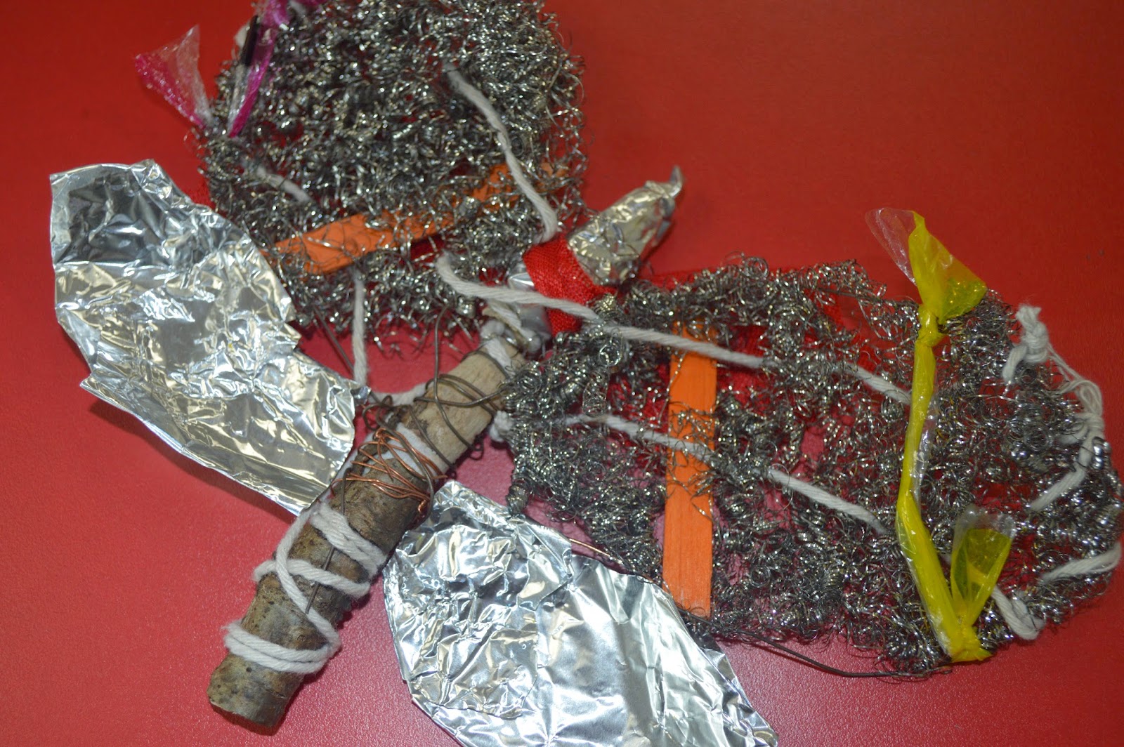


First off I'll comment on the time, we were given 30 minutes and for this first drawing i definitely took on more then i first thought was possible. I spent to much time trying to get the details of the string and plastics to have some impact through the steel wire that i didn't have time to even attempt the 2nd wing but for the amount i did complete i really like. Charcoal is a very messy material to use but once you get into the shading you can make some really interesting things happen, for example i think it really help make the string pop over the steel wire to give the image a lot of depth. 
Next we did another 30 minutes drawing with the same material and concept but this time to try using just lines and less shading.


This time i went for the same sort of angled birds eye view but from the bottom section of my moth and i really like the way this piece turned out. Once again we had 30 minutes but i feel i managed that time a lot better and was able to get some really good detail from the line work on the wooden end. As well as focusing on the bold string and wire work around the wood centerpiece.
Next onto the real mess. Indian ink time!


Now this is something i really enjoyed. I used very simple tools, White A2 Paper, Indian Ink Black and a Coffee stirrer, Yes one of those, one end was cut at a 45 degree angel to cause a very fine line when used with the ink and then the other end left as was in a circular shape which worked very well for thicker lines. 
With this drawing i decided to focus on the top again but concentrate it more on the upper right then just the whole top to help cut out the problem of time issues and i went in and it sure got messy fast but was very interesting to determine how much ink i need to apply each time to get the same effect i just made. For example with the wings i was trying to make a crisscross sort of effect but instead of just tapping away i changed my stroke to make the lines thicker in other places to attempt to add more depth within them. I think it worked well for a first try. The one thing i couldn't get to work in my favour was the string, i couldn't get it to pop as i added to much ink to the wing and didn't fade it out well enough. I'd definitely go back and try that different next time.