Showing posts with label Sketch. Show all posts

Sunday, 12 October 2014

Fashion: Charcoal Drawing & Development

 In one of my last lessons in Fashion, I was tasked with producing 2 quick 15 minute sketches of paper manipulated dresses with charcoal. After producing two then I was to work into one of them with paints, inks, newspaper etc but keeping in the theme of Mono Mania. So black and white.


Above is the first of my charcoal drawings and the one I didn't work into later on. This was my first quick sketch and as such isn't complete as I missed judged the time I had to get down all the details I needed to make it fully complete in my eyes. It did help me though as it let me experiment with different stroke types and smudging techniques before moving onto my 2nd piece.


Above in my final piece I produced from the morning. It started off as a charcoal sketch very much the same as the one above but as I finished this one and had put more effort into it in the charcoal stage I wanted to take it even further. So I worked into this one more. First off I added newspapers to the scraps in the middle to give the piece more depth. As well as that I added wax [Which i had experimented with in my Batik work] to the bottom section of the skirt to give it some extra interesting detail I couldn't get with the charcoal. Next I added white paint around the edges of the main stem straps to help make it pop off the page as the original piece I worked from had almost highlights in those places from the natural lighting in the room. Lastly I added ink over the wax and white paint to bring back the original charcoal shading I had added on, finally going back over the piece with charcoal adding in details here and there.
I really like work with mixed media and it's something I consider to be one of my strongest strengths. I like the idea of mixing multiple techniques together to see what new and interesting effects can be made. Which I think worked really well with this pieces skirts. The mixture of Ink, Wax and Charcoal really bring the skirt to life.

Thursday, 9 October 2014

Fashion Drawing / Sketches

Not my forte at all, I'd consider my drawing strengths to lie in a field that is much more abstract or closely confined. Such as drawing a head or a torso but drawing a full person in proportion is something I struggle with even with near daily practice.  So having to draw fashion sketches wasn't something I considered myself confident in but I went into it with an open mind as always a created a few quick sketches which i felt held some sort of female form.


As seen above I tried a few different styles First of all truing a very basic block style and then going for a more elegant head title which i feel looks very nice but I was still drawing the shoulder a little to broad. So on the next 3 drawings I wanted to try something a little different, so for the first I went with a different position. Instead of using a straight line for a base, i went with an expanded 'S' which allowed me to get a form in which I could crate a popped shoulder, hip and arm. I feel this came out rather well compared to the original quick sketches even if this was also just another fast sketch. Next I used a different material and tried to quickly sketch another front facing female, however this one I didn't feel worked very well as the charcoal smudge a little to much and made the sketch look very unrefined.
Finally is very much a Fashion Illustration I photocopied a female sketch out of an illustration book and then collage it into my sketchbook on top of newspaper to help break up what I did next. Which was to take another photocopy of my print work  and i cut it up into sharp smaller pieces which I then collage onto the photocopy to create a skirt. I really like the way this turned out as it is very crisp and sharp. If i were to do it again I'd like to make a full dress utilising 2 or 3 different prints to add depth and emphasise shadows.

Friday, 19 September 2014

Ink & Charcoal - The mess continues..

Following the previous day and making a 3D model of an insect i drew [Links in previous post] The next thing I did was to experiment with Charcoal and boy did it get messy. The plan was to focus closely on a small part of our models [Mine being a moth] and blowing it up on an A2 piece of brown paper. We were given 30 minutes of each drawing, the first of which i decided to focus on the top of the model and part of the top 2 wings trying to add some depth by looking at it from a slightly angled birds eye view.


First off I'll comment on the time, we were given 30 minutes and for this first drawing i definitely took on more then i first thought was possible. I spent to much time trying to get the details of the string and plastics to have some impact through the steel wire that i didn't have time to even attempt the 2nd wing but for the amount i did complete i really like. Charcoal is a very messy material to use but once you get into the shading you can make some really interesting things happen, for example i think it really help make the string pop over the steel wire to give the image a lot of depth. 
Next we did another 30 minutes drawing with the same material and concept but this time to try using just lines and less shading.


This time i went for the same sort of angled birds eye view but from the bottom section of my moth and i really like the way this piece turned out. Once again we had 30 minutes but i feel i managed that time a lot better and was able to get some really good detail from the line work on the wooden end. As well as focusing on the bold string and wire work around the wood centerpiece.
Next onto the real mess. Indian ink time!


Now this is something i really enjoyed. I used very simple tools, White A2 Paper, Indian Ink Black and a Coffee stirrer, Yes one of those, one end was cut at a 45 degree angel to cause a very fine line when used with the ink and then the other end left as was in a circular shape which worked very well for thicker lines. 
With this drawing i decided to focus on the top again but concentrate it more on the upper right then just the whole top to help cut out the problem of time issues and i went in and it sure got messy fast but was very interesting to determine how much ink i need to apply each time to get the same effect i just made. For example with the wings i was trying to make a crisscross sort of effect but instead of just tapping away i changed my stroke to make the lines thicker in other places to attempt to add more depth within them. I think it worked well for a first try. The one thing i couldn't get to work in my favour was the string, i couldn't get it to pop as i added to much ink to the wing and didn't fade it out well enough. I'd definitely go back and try that different next time. 

Let the messy times begin! - Day 1 Animals from Nothing

Can't but to create a mess and end up with something interesting at the end!
But to start off before my first day i was given a brief in my final college interview to do a couple insect studies in collaboration with the Liverpool Museum in celebrating British insects, which at first i was a little hesitant about as well i don't like insects. But once i got some basically research done online just looking at photos of moths and beetles etc i noticed they have ALOT of detail close up. Especially the way beetles shells overlap and the different ridges shine in natural light.

So i set out to do a couple fast1-5 minute sketches to get a quick feels for the shapes and forms of the insects and then do a 30-60 minute final drawing of the insects i planned to take further.


After finding the insects i wanted to draw over at [http://www.uksafari.com] i produced the drawings as seen above and took them with me for my first day of college. I Really enjoyed tried to get the shells of the Devil Coach Horse Beetle, it was a bit of a challenge as all i had to work with was pencil and light effects but i feel like the final piece came out rather well. Comparing that to my Stag Beetle drawing i wanted to try something a little different and went with just a pen approach after completing a fast 1 minute sketch to get the proportions down i went for a more of an illustration feel for this once mainly focusing on the outer lines and bold details over shading and forming the true shape of the insect. This left it feeling flat but i really like the way it came out for a 2d version.
My favourite sketch was the moth as i knew i wanted to just go very creative with this one so i chose a moth with very plain tones, the Dark Bordered Beauty Moth worked perfect for this as its just a 2 tone colour moth and it let me experiment with different types of design on the wings and i like what i ended up with. Very simplest line work and a little shading which i feel sticks true to the original insect but adding my own twist onto it.

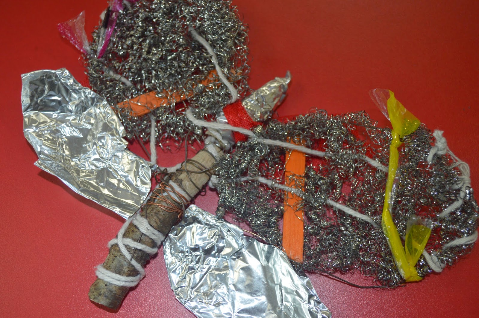
Now back to my first day after filling out all the usual forms and such we got down to business. We were told to look at our drawings and pick one which we would then turn into a 3d model made of of scrap/recycled materials left over from other projects in the college. At first i wasn't sure which drawing to pick as they're all rather flat but i though the stag beetle would make a nice wire piece but wouldn't other much in the ways of expression so i decided on the moth as if i needed i could change the design if needed as it was very much my own creation from the Dark Bordered Beauty Moth design. After pondering over the materials i dove straight in head first and I'm very happy with that i ended up with.


Having decided on a 3D Model of a moth i instantly wanted a solid centre and found two different colour sticks i bound together with wire and then also created 4 wings branching off from this. At first i wasn't sure how i was going to do the wings, either i wanted wire work using sticks and twigs until i found these little steel wool balls which when stretched out and wrapped around the original wire wing work gave me a decent base to work from. Moving on from there it was very much just experimenting which different materials threading them through the steel wool to add depth. I used the likes of string, different colour plastic and coloured lollipop sticks. Finally i added tinfoil to the bottom set of wings and the top of the stick middle piece to help break up the overpowering colour of the grey wool, which i feel worked out well and overall the final piece has a nice texture throughout. 
I'm not normally one to enjoy constructing things with my hands i prefer to have my ideas come through the median of drawing or painting but i really enjoyed experimenting with different materials here trying to add onto a drawing of my own creation.