Showing posts with label 3D Model. Show all posts

Wednesday, 1 October 2014

3D Object Light Photography

Having created a 3D letter at home, in graphics we experimented with lighting effects and how they're cast on objects. My 3D piece as seen below and in my previous piece is of a letter 'H' as I wanted to relate it back to my previous work around the phrase 'Honesty is the Best Policy'. Because of that I made my letter in such a way that it was rough and loose to give the impression of a hidden meaning such as the same with my phrase. As not all things are true and lies are everywhere.


With this I used two different set ups both with 1 lamp each on full brightness. One with a white background the other with a black. The goal was to take up to 20 shots or more of different angles, shadows and focal points.
First here are two shots both with something wrong about them, the first is overexposed and the second a miss focus on my point. All shots were taken under manual focus and settings. The main problem I had was the yellow tint on the bulb and going back I would sort out my white balance after every other shot.


One of the main problems shooting in manual is without a doubt reading the situation wrong and getting an over or under exposed photo or rushing the shot and miss placing the focal point.

All 3 of these shots have zero editing on them for now and i will later do an edit to clean up the backdrop and such but first lets me explain why out of all 20+ shots these are the 3 I feel have the best composition for what i was aiming for.
First up with this angle i made the main focus on the back part of the letter to allow the depth of field to blur out the front portion and allow the shadow to really take form. I really enjoy this photo as its really captures the shape of the shadow and the object.


Next up in this almost central shot, This is a great shot in my eyes as as of the placement of the letter on the backdrop [very near the back] you can see the way the shadow bends its way around and up the white sheet and I really like the way its almost creeping out form behind the letter. The only problem with this shot is the white balance is a little off but i feel even despite that it really works well.

My 3rd favourite shot is this poorly framed but elegantly focused shot. A little off with the framing but can easily crop out the white wall in photoshop. What really shines in this photo is the focus of the letter and how faintly the shadows lay on the letter and escape from underneath it because of the black backdrop. 
I really enjoy photography and consider myself a keen hobbyist and love experimenting with new ideas and concepts such as lamp lights in these shot and playing around with shadows. I really look forward to advancing this shadow play with a live model sometime soon. 


Friday, 19 September 2014

Ink & Charcoal - The mess continues..

Following the previous day and making a 3D model of an insect i drew [Links in previous post] The next thing I did was to experiment with Charcoal and boy did it get messy. The plan was to focus closely on a small part of our models [Mine being a moth] and blowing it up on an A2 piece of brown paper. We were given 30 minutes of each drawing, the first of which i decided to focus on the top of the model and part of the top 2 wings trying to add some depth by looking at it from a slightly angled birds eye view.


First off I'll comment on the time, we were given 30 minutes and for this first drawing i definitely took on more then i first thought was possible. I spent to much time trying to get the details of the string and plastics to have some impact through the steel wire that i didn't have time to even attempt the 2nd wing but for the amount i did complete i really like. Charcoal is a very messy material to use but once you get into the shading you can make some really interesting things happen, for example i think it really help make the string pop over the steel wire to give the image a lot of depth. 
Next we did another 30 minutes drawing with the same material and concept but this time to try using just lines and less shading.


This time i went for the same sort of angled birds eye view but from the bottom section of my moth and i really like the way this piece turned out. Once again we had 30 minutes but i feel i managed that time a lot better and was able to get some really good detail from the line work on the wooden end. As well as focusing on the bold string and wire work around the wood centerpiece.
Next onto the real mess. Indian ink time!


Now this is something i really enjoyed. I used very simple tools, White A2 Paper, Indian Ink Black and a Coffee stirrer, Yes one of those, one end was cut at a 45 degree angel to cause a very fine line when used with the ink and then the other end left as was in a circular shape which worked very well for thicker lines. 
With this drawing i decided to focus on the top again but concentrate it more on the upper right then just the whole top to help cut out the problem of time issues and i went in and it sure got messy fast but was very interesting to determine how much ink i need to apply each time to get the same effect i just made. For example with the wings i was trying to make a crisscross sort of effect but instead of just tapping away i changed my stroke to make the lines thicker in other places to attempt to add more depth within them. I think it worked well for a first try. The one thing i couldn't get to work in my favour was the string, i couldn't get it to pop as i added to much ink to the wing and didn't fade it out well enough. I'd definitely go back and try that different next time. 

Let the messy times begin! - Day 1 Animals from Nothing

Can't but to create a mess and end up with something interesting at the end!
But to start off before my first day i was given a brief in my final college interview to do a couple insect studies in collaboration with the Liverpool Museum in celebrating British insects, which at first i was a little hesitant about as well i don't like insects. But once i got some basically research done online just looking at photos of moths and beetles etc i noticed they have ALOT of detail close up. Especially the way beetles shells overlap and the different ridges shine in natural light.

So i set out to do a couple fast1-5 minute sketches to get a quick feels for the shapes and forms of the insects and then do a 30-60 minute final drawing of the insects i planned to take further.


After finding the insects i wanted to draw over at [http://www.uksafari.com] i produced the drawings as seen above and took them with me for my first day of college. I Really enjoyed tried to get the shells of the Devil Coach Horse Beetle, it was a bit of a challenge as all i had to work with was pencil and light effects but i feel like the final piece came out rather well. Comparing that to my Stag Beetle drawing i wanted to try something a little different and went with just a pen approach after completing a fast 1 minute sketch to get the proportions down i went for a more of an illustration feel for this once mainly focusing on the outer lines and bold details over shading and forming the true shape of the insect. This left it feeling flat but i really like the way it came out for a 2d version.
My favourite sketch was the moth as i knew i wanted to just go very creative with this one so i chose a moth with very plain tones, the Dark Bordered Beauty Moth worked perfect for this as its just a 2 tone colour moth and it let me experiment with different types of design on the wings and i like what i ended up with. Very simplest line work and a little shading which i feel sticks true to the original insect but adding my own twist onto it.

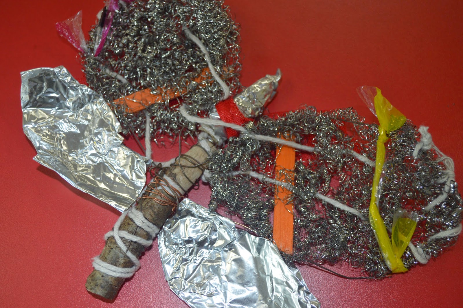
Now back to my first day after filling out all the usual forms and such we got down to business. We were told to look at our drawings and pick one which we would then turn into a 3d model made of of scrap/recycled materials left over from other projects in the college. At first i wasn't sure which drawing to pick as they're all rather flat but i though the stag beetle would make a nice wire piece but wouldn't other much in the ways of expression so i decided on the moth as if i needed i could change the design if needed as it was very much my own creation from the Dark Bordered Beauty Moth design. After pondering over the materials i dove straight in head first and I'm very happy with that i ended up with.


Having decided on a 3D Model of a moth i instantly wanted a solid centre and found two different colour sticks i bound together with wire and then also created 4 wings branching off from this. At first i wasn't sure how i was going to do the wings, either i wanted wire work using sticks and twigs until i found these little steel wool balls which when stretched out and wrapped around the original wire wing work gave me a decent base to work from. Moving on from there it was very much just experimenting which different materials threading them through the steel wool to add depth. I used the likes of string, different colour plastic and coloured lollipop sticks. Finally i added tinfoil to the bottom set of wings and the top of the stick middle piece to help break up the overpowering colour of the grey wool, which i feel worked out well and overall the final piece has a nice texture throughout. 
I'm not normally one to enjoy constructing things with my hands i prefer to have my ideas come through the median of drawing or painting but i really enjoyed experimenting with different materials here trying to add onto a drawing of my own creation.