Showing posts with label Elements of Design. Show all posts

Tuesday, 10 February 2015

Graphics: Illustrator shoes.

Carrying on with my elements of design brief and still working in Illustrator my next task was to research Sarah Beetsons work and bring in an object to draw in Illustrator. Since I was looking into Sarah Beetsons work it only seemed right to take her work with shoes and draw my own shoe.
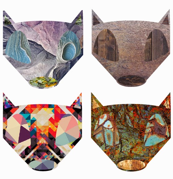
What I enjoyed most about her work is the very clear clean lines with a nice 60's feel as of the bright use of vibrant colours.


So before even looking into Illustrator I took a photo of my subject so I had a static image I could look at and draw from since I wanted the image to have a 2D feel to it since I planned to use just lines to make up the basic shape.


Taking the photograph into Illustrator I used it as a template to create my basic shape for the shoe as seen above. I did this by drawing sections at a time on different layers using the pen tool as the node feature allows for easy shaping and corrections to the base drawing. After I had the basic shape down after alot of small fixes to make sure certain sections didn't over lap (which would be more noticeable when colours added) My next step was to add stitch lines and air holes to the main shoe and use the same technique of adding line spacing to my base line from the pen tool to give off the grip texture on the front of the shoe. I feel this really brings the shoe to live. The extra detail such as that and the shoe lacing eyes really make this piece jump out I feel.

 The next step was to add colours to each shape. Doing this allowed me to focus on any missed imperfections I may have over looked in the original line work. 
With a focus on colour and clean design I ended up making a sleek red and blue/purple shoe after such went for a more unique colour scheme looking back at Sarah Beetsons work again for guidance. After finalising the 4 pieces I added some tonal colour as backgrounds to help the final pieces pop off the page. I feel this worked really well with what I was aiming for.


Sunday, 7 December 2014

Graphics: Illustrator

Having completed my pathway stage, I decided to specialise into Graphics, this was largely down to the fact it was the pathway I enjoyed the most and was the area where i wanted to learn more. Having specialised I was then given my first brief 'Elements of Design'.
Like the pathway stage this brief is very much an experimental way into graphical techniques, such as: Line, Tone, Value, Depth, Shape, Texture, Colour and Space. The main reason for this is to acquire a bunch more skills which we can then further dive into when given more specific briefs.

For the first part of this lesson I was given the task for going into Illustrator, which I had near to no knowledge of bar making typography pieces. With that I was told to use just the basic shapes to create very simple animals, which I would then be adding textures to in layers to give off different interesting effects. 


Having got my basic shapes down I then took my Panda head and fox head that I made and started to add textures I found online to these shapes. First I went for a monotone type effect for the panda heads sticking to there original colours. However I'm not really sure I chose decent textures which work together as they're very detailed textures and as such clash.
With that in mind, for the foxes I decided to use related textures on the same piece. This worked well as using rock, wood, rust and hyper detailed textures on the same piece turned out rather well. I think my favourite piece is the rust textures. As these 3 different textures contrast really well with one another. I also like the hyper detailed one as the colours are so in your face it makes the fox head look even more interesting. Because of that I decided to down scale that piece and repeat it over an A4 size page to create a pattern.

I think this turned out really nicely and makes me think of other ways in which these designs could be used. If I made say a deer or a Robin the design could easily be used for Christmas cards. Or going along with the current designs, stickers, pins or even logos. There are so many different uses for these quick little designs.


Lastly I wanted to take my fox design one step further and give the poor fella a body to go along with his majestic head. Looking back at this piece now I wish I either made the body more pointy like the head, or made the head more pointy to go with the softer rounded body. However after completing the outline in Illustrator I then came up with the not so original idea of a 'fire fox' and as such only used fire and light textures to finish him off.
I really like the effect this gives off and I will be going back at some point to create a more rounded off fox before adding texture to give a more finished feel to the piece. I would normally use photoshop for this sort of piece but the more I use Illustrator I feel the more I will end up coming around to it.