Showing posts with label Black and White. Show all posts

Sunday, 7 December 2014

Graphics: Photograms

In the afternoon of my first day in Graphics, I was shown around the photography dark room and as such given a full introduction into said room. This included going over the basic health and safety rules such as the normal:
Don't Eat, No phones, Coats and bags to be stored safety out of reach to prevent tripping, Always wash hands after working with chemicals, Chemicals to be prepared by staff online, not to crowd the darkroom, a staff member must always be present, throw away rubbish and to use tongs when moving paper between trays.
After such I was shown how to create photograms just using objects the light projector and photographic paper. This quickly peeked my interest, as having a keen hobby in photography but mainly digital. Working in the realms of film development made me rather giddy and as such I quickly produced 3 photograms on the light projectors and then took them over to the developing tray. That minute of just standing there watching the image appear on the photographic paper is something else and instantly made me want to keep making more but alas time restraints. So after a minutes I moved the images from the Development chemicals to the stop baths and then to the fixing chemical for another 5 minutes and finally to the wash bath where they sat for 20 minutes to remove any of the excess chemicals. 
I can see this process getting very mechanical when working on a large film roll. Constantly walking back and forth seeing your images come to life from film. As such I cannot wait to get the chance to try it again.

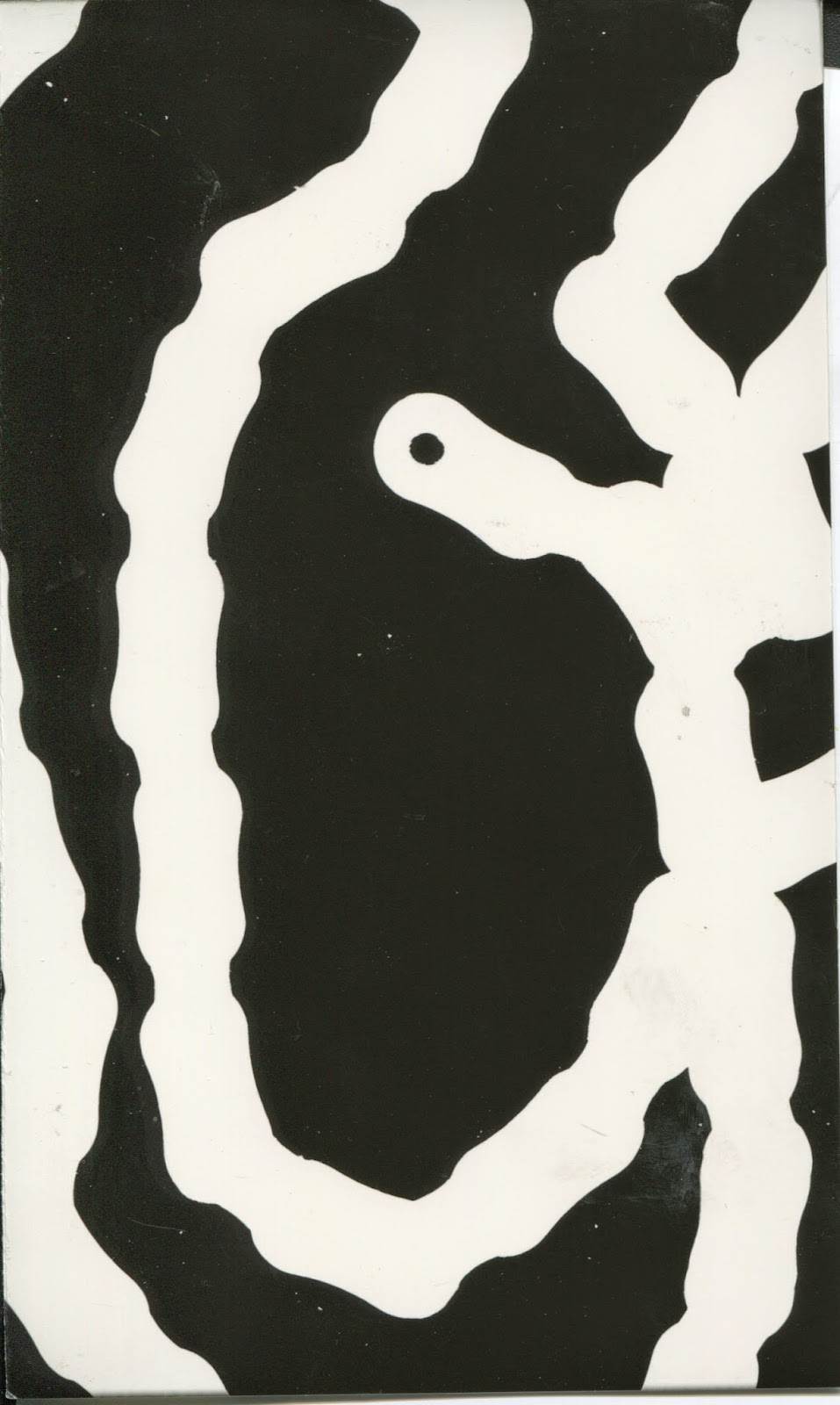


These were the 3 photograms I ended up making. For the photos themselves I added on different items to stop the light from hitting the photographic paper in areas to create images and shapes. As such depending on the thickness/opacity of the item some light may or may not get threw. For example the first 2 piece I picked were a thistle type flower which has a lot of sharp little bristles coming off it which the light picked up really nicely. Secondly I chose a thick metal chain for this I knew the light wouldn't pass threw it and as such I overlapped the chain and try to place it in an interesting way which I feel came across in the photo.
Lastly the photo on the left, I tried multiple thinner and more organic objects, such as leaves and a shell but then I decided I wanted this piece to have a lot of over lapping aspects so I added on some Iron wool and bubble wrap. You may notice there is a large area in which there is just black space below the iron wool. This is where the bubble wrap was but as its a very clear material the light was let through easily and as such I should have left it in the developing chemical for a shorter time to have it show up. However you can see in the middle of the image part of the iron wool is blurred out where the bubble wrap was overlapping the top of it. I like this effect as it show the experimentation of the piece. Overall I really enjoyed making these photograms and cannot wait to give it another go.

Saturday, 4 October 2014

Printed Images - Manipulation linking to Bridget Riley & Victor Vasarely

Following my Monomania foam printing work, once all the prints on fabric and paper had dried I went onto photocopying these pieces in A3 and A4 sizes and went to work with the scissors once again and taking what I learnt from the original paper manipulation and mixing that in with these new prints, I aimed to create a bunch of different unique patterns. Doing so by cutting the photocopies, mounting on card, weaving, overlaying and all round working with paper on paper.


So my main goal with these pieces was to try and recreate some of the techniques seen in Bridget Riley's and Victor Vasarely work. By using the same sort of line structure as them. Using waves and very sharp straight lines. To add my own spin on that I aimed to layer these techniques and using the original prints as back drops.
As well as doing that I added in paper and card to to help break up some of the more intense designs so not all the detail was lost. For example the first image, since I purposely used a waveform that went against the striped print it really pulls your eye in, very much like the OP art I've been researching and trying to mimic here. But by adding in the bland newspaper it helps break that down a little bit and once the viewer pulls away they can look into the less detailed part and this helps let the design pop out.
Following that the same sort of thing happened in the second image but the use of newspaper was more to pull the design off of the black back ground as the print was printed on black too. So by adding newspapers it helped further push the design to the front and lets the spaces between the cut strips go to work in drawing in the viewers eye.


Now for the last 3 they were the first 3 I worked on trying to recreate the very essence of Bridget Riley's work and how she used her lines to create movement. However I wanted to do that in revere with the first 2 prints. Having the prints as the background and working with cut paper to create a sense of movement in the work. I feel this worked best in the first piece as its a very simple overlay which creates this sense of stubble overlap that lets the design really pop off of the page. However in the second piece I feel the overlay is a little to extreme and the sense of movement is lost, but it came in handy as a learning tool to know what not to do next time. because of this when it came to having my sewing machine induction I used this piece to test out the different needle widths, lengths and zipzag spacings which can be seen below.
Lastly is a very simple but effort use of straight cuts of one of my black prints put onto white card which really helps break up the design and lets the white ink almost blend into the background. I feel this piece most represents Bridget Riley's work in my own style.