Victor Vasarely:
First clip I watched is an 8 minute piece showcasing some of Victors work to music. The first thing i noticed about his work is that it is very crisp and clean. All the lines and colours a very prominent and his work feels very complete, it has a very mathematical feel to it. The pieces are very strong on your eyes because of his use of vibrant colours and visual effects. He uses scale to some other level, you tell can he has put a lot of time and effort into his work perfecting his scales of shapes to gives off these extreme illusions to the human eye making the pieces feeling and seem almost 3D.
I wasn't to fussed on the music as it felt like any other ambient transition music which at first worked with his pieces but ended up bringing down his work i feel as it drew my attention from looking at his work to zoning out because of the music. However his work is very pleasing to the eyes as long as you can stand the colours and illusions. I personally quite like it and I feel it has influenced me in such a way to try making more colour pieces out of just shapes and crisps lines/colours.
Next I watched a 4 minute interview with Victor Vasarely as he explains his mathematical concepts. This video very much speaks for itself and i can't really put it into better words. Victor Vasarely basically explains how he came up with his idea for his pieces by relating it back to the most common of human knowledge, maths, the alphabet, music and basic shapes the circle and square and with that in mind he added numbers to his colours creating his own colour alphabet and by studying basic geometry he came up with his idea. Honestly I'm not sure if its the way the translator spoke or just his metaphors but I can't take much away from this interview as it feels very lackluster to me and i can't put my finger on way. He used basic geometry to create shapes, maybe he was the first but in modern art and graphics of today you can create pieces like this is an instant. Maybe I'm over looking the fact but I enjoy his work but maybe i just don't like him.
Bridget Riley:
A short minute clip of Bridget Riley speaking on her work and how important the concept of movement and shape are. I really enjoyed this video the way it has been edited works really well as its showing everything she is saying in a visual way. For example how the camera pans out on a bunch of wavy lines to show the effect they have as lines groups of lines to being amassed together and the effect it gives. She very much has a way with words. The use of making the lines larger or smaller give the final piece a life of its own and the way its put across is very visual in this video and i think it work really well. It really make you think about your own work and how changing a lines thickness or thinness can give your piece and completely different look.
Finally I watched this video, a clip of the art critic Andrew Graham-Dixon enthusing about the work of Bridget Riley. What is really the most interesting out of the 4 videos I've watched and that is mainly down to the fact of the link to traditional art. How the traditional art show casted and Andrew clearly points out how it is extremely related such as the flowing 'musical' feel of the first piece shown and how that is represented in her own work with the flowing of her own wavy piece. The thing i most definitely take away most from Bridgets work is knowing when and how you can change lines to add more depth and feeling into my own work. Having seen how she was inspired by traditional art and adding her own ideas and style to create something related to the original but completely her own I feel nothing but motivation to dive straight into doing even more research.
Sunday, 28 September 2014

Saturday, 27 September 2014
Monomania - Foam Printing
Foam print block making :|
Making a mess with paint and printing :D
Possibly the best way I could describe this session. I can't help but love anything where I get to be messy and make unique mess into something fun and creative. Following my work on the shape shape I picked one of my final shapes to make out of a piece of foam which funnily enough is from the bottom of a pizza box but enough of that. To cut the foam I used a soldering iron which utterly stunk up the room I was working in so we had to open all the windows. I'm just glad I went first so I didn't have to stand around for ages waiting to cut my shape and having to smell what I can only describe as a melting rubbish, kind of smell.

I think my shape turned out rather well considering I hadn't held a soldering iron since i was about 13 in DT class back in school. I didn't just want to use my shape for the printing block as it would make the print very bland and boring so i added a few drops and squiggles here and there. Which as you'll see below really helped when it came to adding the acrylic paints and printing.


I produced patterns with my tear drop styled foam print block on 4 different types of material, black paper, white bin liner, white fabric and stripped fabric. Using 3 different colours of acrylic paint, white, black and grey and it go messy fast. I wish i took a photo of my hands at the end of it. I still have paint dried on my nails at the time of writing this.
I really enjoyed making these prints as it was a very unique process for me and the way all the work has been linked together. Having to move the block in different directions and overlapping of different colours made some really interesting patterned appear. For example I really love the way the prints look on the stripped fabric as where I cut away at the foam print you can see the fabric coming through the prints as well as where there was less ink on block giving the print a very unique look which will give even more depth once the excess material is cut away. Using a foam block is a very quick and easy way to make a printing block and is something I would like to incorporate into some of my work later down the line as it would come in handy when working on mixed media piece as a little something extra.
Making a mess with paint and printing :D
Possibly the best way I could describe this session. I can't help but love anything where I get to be messy and make unique mess into something fun and creative. Following my work on the shape shape I picked one of my final shapes to make out of a piece of foam which funnily enough is from the bottom of a pizza box but enough of that. To cut the foam I used a soldering iron which utterly stunk up the room I was working in so we had to open all the windows. I'm just glad I went first so I didn't have to stand around for ages waiting to cut my shape and having to smell what I can only describe as a melting rubbish, kind of smell.
I think my shape turned out rather well considering I hadn't held a soldering iron since i was about 13 in DT class back in school. I didn't just want to use my shape for the printing block as it would make the print very bland and boring so i added a few drops and squiggles here and there. Which as you'll see below really helped when it came to adding the acrylic paints and printing.
I produced patterns with my tear drop styled foam print block on 4 different types of material, black paper, white bin liner, white fabric and stripped fabric. Using 3 different colours of acrylic paint, white, black and grey and it go messy fast. I wish i took a photo of my hands at the end of it. I still have paint dried on my nails at the time of writing this.
I really enjoyed making these prints as it was a very unique process for me and the way all the work has been linked together. Having to move the block in different directions and overlapping of different colours made some really interesting patterned appear. For example I really love the way the prints look on the stripped fabric as where I cut away at the foam print you can see the fabric coming through the prints as well as where there was less ink on block giving the print a very unique look which will give even more depth once the excess material is cut away. Using a foam block is a very quick and easy way to make a printing block and is something I would like to incorporate into some of my work later down the line as it would come in handy when working on mixed media piece as a little something extra.
First Time - Shape Sheet
I don't know how in all my years of messing around in art classes from school to my own adventures, I've never done a shape sheet. I've done progression sheets or idea developments but never something as simple as taking a single shape or shapes from an images and then letting my mind and hand wandering creating new patterned and ideas.

Not the best photo I've ever taken and I'm not overly happy with my shape sheet but for a first time I think it turned out pretty well. I would still like to go back and work into it, penning my final work and just some simple colour behind the shapes to make them pop.
However i do like the process of taking my double circle in the top left and branching off, of it into a crazy mess of spirals, Triangles all the way back to teardrop shapes in the bottom right or even the mass of circles in the top right which is a very abstract sort of piece. It's really crazy how much a simple double circle can slowly but surly be changed into something else through this method. Its definitely something I'll be using again when trying to come up with unique patterns and shape fast.
Not the best photo I've ever taken and I'm not overly happy with my shape sheet but for a first time I think it turned out pretty well. I would still like to go back and work into it, penning my final work and just some simple colour behind the shapes to make them pop.
However i do like the process of taking my double circle in the top left and branching off, of it into a crazy mess of spirals, Triangles all the way back to teardrop shapes in the bottom right or even the mass of circles in the top right which is a very abstract sort of piece. It's really crazy how much a simple double circle can slowly but surly be changed into something else through this method. Its definitely something I'll be using again when trying to come up with unique patterns and shape fast.
Friday, 26 September 2014
Monomania - Mood Board
Following my work with paper manipulation i was tasked with collecting and researching images for a Mono mania styled mood board [Black and white images] that would be all well an easy but i linked it which my paper garment and stuck with a theme of circles and spirals. I sourced most of my images from pinterest [Click to see my pinterest] Then went to work cutting out all the images and started to form my mood board in class.

After A LOT of overlapping, reshuffling and all round frustration i finally got my images into a way i liked. This involved cutting images out in spirals, cutting out perfectly and tearing the images out as you can see above. After taking a photo so I could remember how i wanted to layer them I started to stick them and in the process changing one or two things around. At this point I knew i didn't want a typical square mood board so i decided to start cutting again.

This is what I ended up with after a lot of trimming and trimming and trimming. I like how the shapes aren't perfect circles which gives them a very organic feeling however a problem arouse. I didn't have a clue how I wanted to mount my now 3 littler mood boards. After thinking of mounting them on their own or together I decided on mounting them together but over lapped so the original overlapping of images was skewed. Which I really liked how it turned out.

As seen above i overlapped to two small mood boards over the larger one and roasted them slightly to give an extra offset of images while also trying to have the colours of the shape bounce off the mood board below it. I first stuck them onto a white sheet of paper cut out and then did the same on a black piece to make the mood board pop ever so more.
I really enjoy making mood boards as you have alot to play around with and depending on the topic and/or theme you can really express the type of mood you want. In this monomania mood board I wasn't aiming to express a mood per say but more let it show the expressive side of circles and spirals though a different array of images from photos to paintings with ink to computer generated graphics and I think it worked out really well.
After A LOT of overlapping, reshuffling and all round frustration i finally got my images into a way i liked. This involved cutting images out in spirals, cutting out perfectly and tearing the images out as you can see above. After taking a photo so I could remember how i wanted to layer them I started to stick them and in the process changing one or two things around. At this point I knew i didn't want a typical square mood board so i decided to start cutting again.
This is what I ended up with after a lot of trimming and trimming and trimming. I like how the shapes aren't perfect circles which gives them a very organic feeling however a problem arouse. I didn't have a clue how I wanted to mount my now 3 littler mood boards. After thinking of mounting them on their own or together I decided on mounting them together but over lapped so the original overlapping of images was skewed. Which I really liked how it turned out.
As seen above i overlapped to two small mood boards over the larger one and roasted them slightly to give an extra offset of images while also trying to have the colours of the shape bounce off the mood board below it. I first stuck them onto a white sheet of paper cut out and then did the same on a black piece to make the mood board pop ever so more.
I really enjoy making mood boards as you have alot to play around with and depending on the topic and/or theme you can really express the type of mood you want. In this monomania mood board I wasn't aiming to express a mood per say but more let it show the expressive side of circles and spirals though a different array of images from photos to paintings with ink to computer generated graphics and I think it worked out really well.
Creative Typography - Letter Cliches in Illustrator
Following on from my work in Photoshop with making digital letters and using said letter with changed forms to create digital words around well known cliches. I used the word 'Honesty is the Best Policy' and carrying on with that phrase I moved over from Photoshop to Illustrator.
From my cliches i took the word 'Honesty' and then played around with manipulating that word further with various Illustrator techniques.

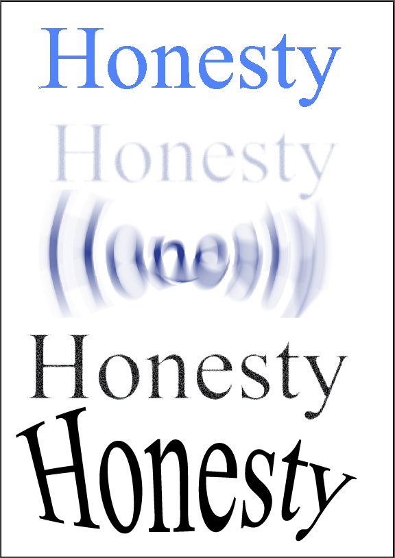

First things first in Illustrator I first off used the type tool to write the word 'Honesty' and then went onto effects and then adding different filters as you can see by the first photos. I played around with such effects as Cutout [being the first image], Radial Blur [3rd image], Warp Bulge [Last image]. I really like the effect you can get out of the last image on the first photos [Warp: Bulge] as you have a lot of ability to turn the letters in whichever way you like.
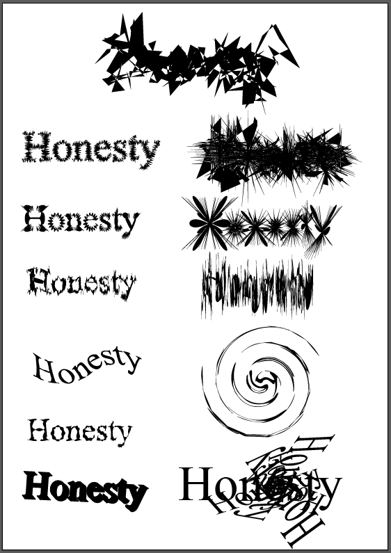
In the 2nd photo i started to manipulate my word by using the transforms effect. This is an effect i really enjoy as you can get some many different and unique effects just by playing with the angel setting alone. Couple that with the different scales and movements you have with the horizontal and vertical you have a wide array of different effects. So i took my hand to creating spiral effects which I think turned out very well however i found it very time consuming to get the desired effect I wanted but now i have the settings i can go back anytime to recreate it.
Next I experimented further with some of the other distort and transform effects and this is where i found some i really loved. In order Roughen, Pucker & Bloat, Tweak, Twist and then finally another 3D and another transform. I didn't really enjoy the 3D effect as it seemed a little to clunky to get to work as depending on the font it can block out some of the letter form. I mostly enjoy the randomness of the Roughen and Plucker & Bloat effects, I like how just when only slightly added it gives a fuzz/buzz effect and when cranked all the way up it gives such a detailed explosion of lines and shapes.
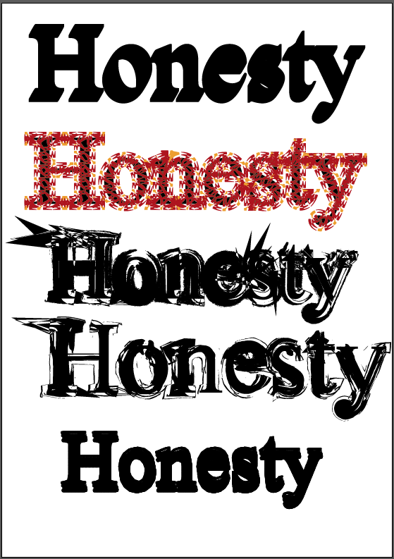
The second last thing I experimented with in Illustrator was adding brushes to the outline of text which can be seen on my final photo. This was a very tricky process as a lot of the brushes added effects that overlaid the text in such a was made the word unreadable which is an effect i wasn't aiming for this time.
Lastly in Illustration my aim was to manipulate my words which had a artistic brush added to it further by adding symbols. For the symbols used in my image above are from the grime vector pack and dot pattern vector pack. I really love the ink feel from the grime pack as it works well with the artist brush added onto the image, it gives the image a lot more depth and wild feel. As well as that the drip symbols help make the word feel a lot more alive as if its really been drawn.
From my cliches i took the word 'Honesty' and then played around with manipulating that word further with various Illustrator techniques.
First things first in Illustrator I first off used the type tool to write the word 'Honesty' and then went onto effects and then adding different filters as you can see by the first photos. I played around with such effects as Cutout [being the first image], Radial Blur [3rd image], Warp Bulge [Last image]. I really like the effect you can get out of the last image on the first photos [Warp: Bulge] as you have a lot of ability to turn the letters in whichever way you like.
In the 2nd photo i started to manipulate my word by using the transforms effect. This is an effect i really enjoy as you can get some many different and unique effects just by playing with the angel setting alone. Couple that with the different scales and movements you have with the horizontal and vertical you have a wide array of different effects. So i took my hand to creating spiral effects which I think turned out very well however i found it very time consuming to get the desired effect I wanted but now i have the settings i can go back anytime to recreate it.
Next I experimented further with some of the other distort and transform effects and this is where i found some i really loved. In order Roughen, Pucker & Bloat, Tweak, Twist and then finally another 3D and another transform. I didn't really enjoy the 3D effect as it seemed a little to clunky to get to work as depending on the font it can block out some of the letter form. I mostly enjoy the randomness of the Roughen and Plucker & Bloat effects, I like how just when only slightly added it gives a fuzz/buzz effect and when cranked all the way up it gives such a detailed explosion of lines and shapes.
The second last thing I experimented with in Illustrator was adding brushes to the outline of text which can be seen on my final photo. This was a very tricky process as a lot of the brushes added effects that overlaid the text in such a was made the word unreadable which is an effect i wasn't aiming for this time.
Lastly in Illustration my aim was to manipulate my words which had a artistic brush added to it further by adding symbols. For the symbols used in my image above are from the grime vector pack and dot pattern vector pack. I really love the ink feel from the grime pack as it works well with the artist brush added onto the image, it gives the image a lot more depth and wild feel. As well as that the drip symbols help make the word feel a lot more alive as if its really been drawn.
Thursday, 25 September 2014
Creative Typography - Letter Cliches from Photoshop
Carrying on with my creative typography [Part 1, Part 2] the next step was to take my new alphabet created in photoshop from my oriental photos and to create a word/phrase out of it. For this I worked with using cliches. I used the cliche 'Honesty is the best policy' As i have always felt this saying held a lot of weight behind it and would work well with my different letter forms as they no longer hold there original form. I feel with this phrase it add an extra element to it as the phrase itself is very much centred around not lying and always behind honest with ones self and others around you. By hiding it behind a new layer of language it creates that wall around the phrase showing what effect it has on the reader/person trying to break down the lies to get to the honest truth.
 Honesty.

Honesty is the Best Policy.
I really liked the way the final letter forms looked together in an A-Z style but now I've formed a word i don't really like how some of the letters work next to each other. I feel this is because of my choice of harsh vibrant colours but what i really love about it is the way some of the letter forms have been lost making it harder to read the words giving this saying a lot more weight behind it! I'd decently want to go back and revisit this and add a consistent colour scheme throughout the whole piece to see what sort of change it would have on the piece.
Looking at the single word of honest as above with the 'HITBP' i feel the lose of letter forms works really well with the message of hiding honesty as so many of people do. However unlike the colour scheme in the 'HITBP phrase' above, i really like the way the colour worked in the 'Honesty' piece. I didn't plan on this and just got lucky as i used the 2 letter forms going 1 cutout filter, 1 threshold and repeating. I fill this styled worked a lot better then the use of the same style for the whole word.
Honesty.Honesty is the Best Policy.
I really liked the way the final letter forms looked together in an A-Z style but now I've formed a word i don't really like how some of the letters work next to each other. I feel this is because of my choice of harsh vibrant colours but what i really love about it is the way some of the letter forms have been lost making it harder to read the words giving this saying a lot more weight behind it! I'd decently want to go back and revisit this and add a consistent colour scheme throughout the whole piece to see what sort of change it would have on the piece.
Looking at the single word of honest as above with the 'HITBP' i feel the lose of letter forms works really well with the message of hiding honesty as so many of people do. However unlike the colour scheme in the 'HITBP phrase' above, i really like the way the colour worked in the 'Honesty' piece. I didn't plan on this and just got lucky as i used the 2 letter forms going 1 cutout filter, 1 threshold and repeating. I fill this styled worked a lot better then the use of the same style for the whole word.
Wednesday, 24 September 2014
Creative Typography [Final A-Z Pieces]
Following on from my previous creative typography post, After a lot of editing and correcting a few minor images i wanted to tweak i have complied all A-Z images. This includes my original photos, my threshold [black & white] edits and my 'Cutout / Stencil styled' edits.

Original Photos - A - Z [No edit - Straight out of camera]

Threshold Edits - A - Z

Cutout Filter / Stencil Styled Edit - A - Z
I really enjoyed the whole process of manipulations my originals photos to get to a point of having my own alphabet in photoshop. The threshold edits were nice to do but overall i feel they don't have the same sort of impact as the cutout filter edits. I think this may be because i prefer the way you can change the colour to very vibrant and eye catching colours where as the threshold just gives a very flat feeling to the photos.
What I enjoy most about the Cutout edits, is the way the original letter shapes are completely warped and simplified. Making some letters such as C, E, L lose all form and give the use of the alphabet to create a word or phrase a really interesting aspect, which is something that will be explored at a later date using cliches phrases and sayings.
Original Photos - A - Z [No edit - Straight out of camera]
Threshold Edits - A - Z
Cutout Filter / Stencil Styled Edit - A - Z
I really enjoyed the whole process of manipulations my originals photos to get to a point of having my own alphabet in photoshop. The threshold edits were nice to do but overall i feel they don't have the same sort of impact as the cutout filter edits. I think this may be because i prefer the way you can change the colour to very vibrant and eye catching colours where as the threshold just gives a very flat feeling to the photos.
What I enjoy most about the Cutout edits, is the way the original letter shapes are completely warped and simplified. Making some letters such as C, E, L lose all form and give the use of the alphabet to create a word or phrase a really interesting aspect, which is something that will be explored at a later date using cliches phrases and sayings.
Subscribe to:
Posts (Atom)