Saturday 26 November 2016

Black Friday & Cyber Monday | SALE!


New photo print just for this weekend and 50% sale on select prints: be sure to check it while this weekend is happening.

Come say hi

Store
Twitter
Facebook

Sunday 9 October 2016

Fine Art Final Piece First Year [Belated post - July 2016]


Let me know what you think and maybe i'll explain what its about, the thought process behind trying to figure out the piece is apart of it.

Anyway I've really neglected this blog over summer while I've been working on personal projects and such. Be sure to check out my Twitter and Instagram for things that have been happening and are currently happening...
New shop and prints coming very soon keep your eyes peeled.

Harry out.

Thursday 19 May 2016

First Year Show - Graphics Final Piece.


For my final graphics projects we were given a self directed brief in which we had to show ourselves by telling our 'creative story' through a piece. This included trying to get across my work ethic, personality, inspiration, values and our truth. The main thing i had to remember with this piece of work was that it was not a cv but to express myself in my truest form. 
At first I found the idea of this rather hard as expressing oneself also means to knows oneself and I feel people tend to change a lot depending on the time, So i tried to focus mainly on what my ideals are and what inspires me. As such I came up with the themes of glitch art as it not only inspires me its the form of design and art I enjoy working in the most. The random elements to this form also creates interesting and unique patterns and style which can be manipulated in ways otherwise not thought of. This coupled with my design ideals that design doesn't always have to be perfect / legible as long as the main idea is shown somewhere in the work, whether that be indirectly or though a message etc.

With these ideas in place I went to work experimenting with what I wanted to make an in what style, Did i want to make a short video a selection of prints, business identity a product etc etc the list was endless. However since this project was to express out creative story, my end goal is to work for myself freelance, so i went with the theme of making self promotional products, this included business cards, a poster and leaflets. I looked at such companies as Bibliotheque and Cartlidge Levene as the way in which they present a brand identity was really interesting to me and helped me have an idea of how I wanted to layout my products.


I'm really happy with the way the business cards and poster came out keeping them in the same style and theme. To create the main body of the poster i used photos from my previous years work (mainly the final project images) and then manipulated to the extent of no longer being legible. This was done through a wide array of different glitch / pixel art techniques from scripts to editing in word pad. I looked at the works of David Carson and omocat for further inspiration on layouts, style and logos. As I wanted a simple block based logo which would't over power the rest of the design. Not only does this tie in with the theme of my creative story and moving forward onto the 'next idea' the tag line 'Next Idea' was also born. This tag line no long fits in with my end goal but also with the style of work, as glitches are random and expressive as such the next idea is just round the corner. I also believe you cannot have a good piece of work without a good idea before hand.


                  Leaflet Front                                                                             Leaflet Back

With my poster and business cards all set up printed and ready to go for the exhibit all that was left was to wait for my leaflets to arrive on time but due to the bank holiday the week before which I forgot about my order got delayed, As such I didm;t have them up in time for the exhibit. I printed them out on basic stock card but the effect and shine of the card just didm;t look right on them so I choose not to exhibit them. I feel this was the best choice as I was not 100% happy with them but I would use them again in the future given the opportunity too.

Overall I am really happy with how this project turned out and it was really nice to see the final products up and displayed on a wall where they should be. The strong colours which were perfectly printed really set my work off and allowed it to be easy to see and very eye catching. I'm happy with the end design, with the logo being really simple but effective and having my peers agree made it all the more worth while.

Monday 9 May 2016

Cranbook styled Blade Runner Poster


Moving on from my initial research of Cranbrook style and mainly focusing on the work of David Carson, I started to collect imagery from the film and cutting and pasting it by hand into new piece of work. Focusing mainly on layering of the same images and matching similar and very different pieces to see what type of effect I;d create. With a few of these then pieces I worked into them further by photocopying them flipping and rescanning them to get myself a collection of wacky images which fit with the themes of the film.

After having a small body of collaged images I moved into photoshop and started to manipulate these images further with digital means focusing on the style of David Carson, using his unique anti formative design style, moving away from grids and focusing on free forming work. This ended up with me producing a poster which I wanted to have a free feeling to it. So it doesn't technically have a correct way to be presents. I tried to make ti so by having text shown at different angles and not giving it a main focual point. With Blade Runner being a very futurist final I always wanted to use something spacing for the main ascent, hens the multi edited earth in the background, but the main story is set within a metropolis so I tried to also form the credits text in the space of a skyscraper this links back to the idea of showing the poster any which way. As if you have it in the normal frame with the blade runner as the focal the credits / tower is up side down. If you have it on its side it would upside down or just on its side, this has a nice effect due to the angle the credits are vectored which has a nice effect I feel.


Final Poster
Poster Final took a lot of different tweaks and editions due to not wanting to over crowd it or use to many strong colours which could be distracting to the overall aesthetic I was going for.
I ended up going for a white strip effect over the colour renditions for this very reason, its not as harsh on the eyes and doesn't distract unlike the multi colour versions.

Information Graphic for Blade Runner
As for the info graphics I wanted to focus on things outside of the film, such as other flops, as Blade Runner in terms of box office takings made less money then it did to make. Other such films were The Thing, Poltergeist and Tron. I wanted to showcase information like this, which relates closely to Blade Runner itself as such I also listed some of Ridey Scotts other fan favourite films.
However this being an info graphic thats going alongside a poster for Bladerunner I thought i should share some facts retaining to the film, such as the upcoming sequel in 2018? and the most popular discussion to the film, is Deckard and nexus? Since this question is widely debated I wanted to give it the most pull on the left side of the leaflet. I also made sure to use the less legible style to give it more intrigue about the discussion. Having the type face in a computerist style also gives the question a sense of irony I really like.

Overall I am really happy with the way my Poster and info graphic came out, it links back nicely to the cranbrook style and is heavily influenced by David Carson and the like. I feel if i didn't enjoy this film, the source of the book and the style I would;t have had so much fun as I did. I feel these 3 elements went really well together not only in final outcome but also in what my own personal inspiration and likes are.

Friday 8 April 2016

Room 2 - Site: Specific & Reactive [Art Video]


For my Site Specific piece. I worked within my university building choosing rooms and areas which were rarely used. This included places such as corridors, old forgotten storage areas and unused classrooms.
The piece above Room 2 came about after presenting my art history presentation that year where we entered the room as such in to show off our selective talks and then we all left. This automatically linked with my ideas and themes I had been flowing and as such resulted in this piece of work.

It’s a simple piece showcasing an individual’s (me) walking up to the front of the room bowing to and applause and the action repeating. The fading figure helps reassured this idea of the room being used in a shorthanded sense producing the feeling of faded and repeated use of the same kind.
This piece was shown in the same room it was recorded in for the final presentation.

Let me know what you think down below. Thank you.

Brief extract:
Site: Specific & Reactive will see you making art work that is specifically for a particular site; it will, in short, be site specific.
Site specific work is that which is developed for, made for and seen at or in a particular site; as such, in some cases, (but not all), it is the antithesis of art work which we often encounter in a gallery or exhibition space.
The latter can often be nomadic, appearing in one exhibition space after another, and relating to one curatorial perspective after another in what might be called the ‘white cube’. Such work does not tend to take a lead from, or be informed by any particular site in which it is encountered. Importantly, site-specific work appears in one space or place and one space or place only. Its link and relationship with that space or site is integral and unequivocal.


Data-bending experiments


I've always had a passion for glitches and how they're formed but not formed in that sense of being almost random. So I've been experimenting with creating my own again after work with some last year for a book cover project.

Above is a quick try at data bending and pixel sorting a self portrait of myself.


Thursday 11 February 2016

Science Fiction Movie Poster Analysed.


Interstellar


- Strapline of actors names along the top of the poster.
- 'Interstellar' title and credits pushed to bottom of the poster to not distract the eye from the main image.
- Main image from the film of M.Mcconaughey walking. 
- Very bold and eye catching.
- The simple colour of whites and greys really work strongly together give the centre figure the most room to shine. 


Star Wars: The Force Awakens

- Large photo manipulated images of some of the most iconic Star Wars chatters and paying homage to the older posters. 
- Title pushed to the bottom to give more room for the main eye catching image.
- Colour of red to represent the evil. Orange / grey of Rey in the middle as the natural point and Finn with the opposing good blue. This divide gives a good sense of battle of good vs evil which is prevalent in all Star Wars films.
- This divide between Rey and Kylo Ren gives a good sense of a visual feeling almost as if they're each side of the same coin. It makes for a really strong graphic. 
- Dark base background lining to the film also gives a strong basis for the rest of the image to come to life from the nothingness. 


Bladerunner Breakdown

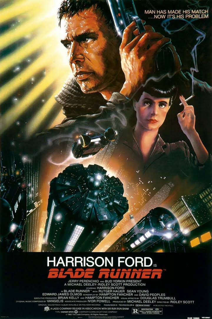
A blend of science fiction and noir detective fiction, Blade Runner (1982) was a box office and critical bust upon its initial exhibition, but its unique postmodern production design became hugely influential within the sci-fi genre, and the film gained a significant cult following that increased its stature. Harrison Ford stars as Rick Deckard, a retired cop in Los Angeles circa 2019. L.A. has become a pan-cultural dystopia of corporate advertising, pollution and flying automobiles, as well as replicants, human-like androids with short life spans built by the Tyrell Corporation for use in dangerous off-world colonization. Deckard's former job in the police department was as a talented blade runner, a euphemism for detectives that hunt down and assassinate rogue replicants. Called before his one-time superior (M. Emmett Walsh), Deckard is forced back into active duty. A quartet of replicants led by Roy Batty (Rutger Hauer) has escaped and headed to Earth, killing several humans in the process. After meeting with the eccentric Eldon Tyrell (Joe Turkel), creator of the replicants, Deckard finds and eliminates Zhora (Joanna Cassidy), one of his targets. Attacked by another replicant, Leon (Brion James), Deckard is about to be killed when he's saved by Rachael (Sean Young), Tyrell's assistant and a replicant who's unaware of her true nature. In the meantime, Batty and his replicant pleasure model lover, Pris (Darryl Hannah) use a dying inventor, J.F. Sebastian (William Sanderson) to get close to Tyrell and murder him. Deckard tracks the pair to Sebastian's, where a bloody and violent final confrontation between Deckard and Batty takes place on a skyscraper rooftop high above the city. In 1992, Ridley Scott released a popular director's cut that removed Deckard's narration, added a dream sequence, and excised a happy ending imposed by the results of test screenings; these legendary behind-the-scenes battles were chronicled in a 1996 tome, Future Noir: The Making of Blade Runner by Paul M. Sammon. ~ Karl Williams, Rovi

Rating [US]:R (for violence and brief nudity)
Genre:DramaScience Fiction & Fantasy
Directed By:
Written By:David Webb PeoplesHampton FancherDarryl Ponicsan
In Theaters:
Runtime:
Warner Bros. Pictures

(Rottentomatoes.com/m/blade_runner/)


Key themes:
Empathy 
Dystopia
Corporate Power
Oppression
Conscience
Morality

Key aspects of the narrative:
The narrative begins before the film starts with a written account of event which happened leading up to what takes place in the film. Bold white texts over a black background fills the page.
The main plot of Bladerunner invokes a hunt or a series of events being discovered one after another building up to key interactions of characters. Theres a connection of different elements which bring different narratives together from the story of the Bladerunner to the creations of replicants, with the gradual decay of our main antagonist. 


Review to come...


INTRO: Semiotics - The Study of Sign


Icon - Something that resembles the actual object it represents

Index - Where the signifier and signified are 'linked'

Symbol - Where the viewer has to learn the connection between signifier and signified.

Context - Where, when and by whom a sign is viewed.


Using this in groups we were tasked with turning a basic fairy tail into road icons to retell the story (in our case we chose Cinderella). At first we wrote out the basic story in order, shortened to the key points to give us a starting point.


With that we then turned each key line into an image to see what we had to work with in terms of scale and action going on within the story.


Since we were tasked with using road signs we decided to try and keep the story as close to original road signs as possible to tell the story. Such as we didm;t want to make out own signs with the basic of what the original are. Such as triangle signs are mainly warnings, square inform and circle order.


And here if our final story. Due to timing we didn't have enough to add every signs as a road sign as such had 2 one with the glass slipper and the slipper being picked up. But overall the story really worked. We used motorway signs to give a sense of travel while the dance a walking stop sign. It really worked and people were able to determine what story it was when prompted to guess.

Friday 5 February 2016

Protest - Daily Project

For today instead of working on our normal projects. We were set with the task of making a protest out of something that matters to us. For me this was internet privacy as such i started out by making posters for this issue.


Edit (12:10) With that I then started to go around the university and stuck the posters onto computer screens to raise awareness about the matter.

Edit (12:38)

Thief plays // Privacy

Would you tell a friend you’ve lost your keys?
Would you tell a stranger your phone number and email address?
Would you walk around shouting about your previous relationships?
Would you store your bank / credit card details on a billboard?

Do you know who is really collecting what you post online?


Edit (14:57) Poster time


Edit (16:30) Instead of posting the posters on all the computer around the campus we went to work learning how to use the Vinyl cutter and make a set of stickers using our campaigns hashtag #WhoseWatchingYou


Complete.. for now.