Saturday 27 December 2014

Graphics: Model Photography

Following on from my previous work on Close up Macro shots of textures. The next thing I was set to do was photographing a model. Unmoving un tiring, a static manikin model, modelling a piece designed by one of the fashion students. We set up a mini studio using 1 diffuser lamp and 2 slave.


Above is what the set up looked like once complete. We added an extra piece of card in front of the model so we could step in on the white background without dirtying the back drop, while getting in close for the more detailed shots.


After taking an array of photos from different angles, levels and distances I felt i had the shots I wanted. In total I only took a set of 25 shots, ranging from close ups to full body shots. Each aiming to capture a different part or feature of the model. This was achieved mainly by thinking about my shot before shooting it. Allowing me to get an idea of what I wanted from the photo before actually closing the shutter.
By doing so I feel i achieved some wonderful photos as seen below.


Here are just 6 of the photos I ended up capturing. I would say these are my favourite pictures from the shot mainly for there composure and keen focus on detail. I really love the close up shot of the cloth over the hand. The composure of the shot works really well against the black model, mainly due to the slightly light cast over the back part of the models hip.
All these photos are straight out of the camera and as such haven't been edited in any way at the present. I plan to go back into them and make the right most edges completely white as the background to give them a more complete feel which I was unable to obtain through photography alone. But alas that is why I love photoshop, It allows me to fix mistakes and blemishes with ease. I really liked the way these shots came out and look forward to doing something photography work such as this.

Graphics Texture Photography

Carrying on from my work with fabrics to make a bunch of textures. Taking all these over to the photography area. I set up a single light and used a white photography table set up to give a clear background. However I wasn't to fussed about the background in these shots as my goal was to get in really close and take some super close up marco shots of these fabric piece.


Above are all 60 shots I ended up taking, if you look closely you'll see the first few shots were over exposed. After a few tweaking in manual I ended up changing the iso and got the right lighting I wanted for these texture shots. This was mainly down to using a preset camera in college and not my own but overall these first shots will still be used somewhere in my work for textures in photoshop. So I've kept them either way.


Possibly my favorite shot as of the amount of depth and detail captured.


The 4 above shots are just some of my favorite ones that I ended up taking from this exercise. I really love the amount of depth that is visible after getting in nice and tight with a macro lens. These will work really well in photoshop for adding some nice textures to different works.  
After ever 3 or 4th shot I ended up changing the position and intensity of the light to try and give different shadows in the shots. I feel this is most seen in my final shot. Having the light coming in from the left making the centre of the pom pom look extra dark. Coupling that with the depth of field with the back pom pom makes this shot really interesting to look at I feel. It'll also work well as a textural piece for something with a lot of focus needed on the right side of the image. 
Overall I found this a very useful exercise and typically I just tend to use free textures or use digitally generated ones for my piece. However having some real shot textures will come in handy I feel.

Graphics: Photograms Edits

Following my first session in the dark room creating some photograms. My next step was to take these photograms and scan them into the computer. Then after importing them into Photoshop I went to work overlaying different colours by adding a colour overlay or burn etc. This involved alot of trial and error with different effects. Seeing which colours worked best with different effect. As just using this method there isn't alot of depth I could have added since the photograms are very flat to begin with.


I really love the way these come out. Using the colour scheme I did, having all 9 edits next to one another gives off a very strong Pop art feel. Very reminiscent of the late great Andy Warhol. Just looking at the Pink chain photogram below the red edit of a dried thistle really makes it pop off the arrangement of photos.


Sunday 7 December 2014

Graphics: Making Textures From Fabric

Following my work in Illustrator and using Textures found on the Internet. The next thing that I did was to go into the fashion studios and steal all their fabrics to create a bunch of different textures using a bunch of techniques I learnt in my pathway stage such as Weaving and different ones such as making fake furs and wrapping yarns around cardboard.


Wrapping fabrics around card.


Layering of Fabrics and crisscross patterns.


Making of PomPoms                                                          Fake Fur sewn onto fabric


Weaving.

All of these will make for some interesting textures once captured with a camera. The close up shots then edited in photoshop will turn out really nicely I feel.
These first few textures focused very much of soft and loose styles, next I moved onto using heat over fabric to make more shiny and raw textures.


Using a soldering iron I cut around a star shaped biscuit cutter to cut through layered fabrics to make shapes.

Using Shibori techniques I elastic banded pasta and coins into man made materials and then used a head gun to form the fabrics around such shapes to give off this effect.


I used the same Shibori techniques on plastic as well to see what sort of effects could be had. As well as using a heat gun to make lines into the plastic to cause different effects.


Lastly combining the Shibori with the Soldering iron to add even more detail and texture into these piece.

 Once these textural piece are photographed and converted they'll turn into a very useful set of digital textures and photographs.

Graphics: Photograms

In the afternoon of my first day in Graphics, I was shown around the photography dark room and as such given a full introduction into said room. This included going over the basic health and safety rules such as the normal:
Don't Eat, No phones, Coats and bags to be stored safety out of reach to prevent tripping, Always wash hands after working with chemicals, Chemicals to be prepared by staff online, not to crowd the darkroom, a staff member must always be present, throw away rubbish and to use tongs when moving paper between trays.
After such I was shown how to create photograms just using objects the light projector and photographic paper. This quickly peeked my interest, as having a keen hobby in photography but mainly digital. Working in the realms of film development made me rather giddy and as such I quickly produced 3 photograms on the light projectors and then took them over to the developing tray. That minute of just standing there watching the image appear on the photographic paper is something else and instantly made me want to keep making more but alas time restraints. So after a minutes I moved the images from the Development chemicals to the stop baths and then to the fixing chemical for another 5 minutes and finally to the wash bath where they sat for 20 minutes to remove any of the excess chemicals. 
I can see this process getting very mechanical when working on a large film roll. Constantly walking back and forth seeing your images come to life from film. As such I cannot wait to get the chance to try it again.


These were the 3 photograms I ended up making. For the photos themselves I added on different items to stop the light from hitting the photographic paper in areas to create images and shapes. As such depending on the thickness/opacity of the item some light may or may not get threw. For example the first 2 piece I picked were a thistle type flower which has a lot of sharp little bristles coming off it which the light picked up really nicely. Secondly I chose a thick metal chain for this I knew the light wouldn't pass threw it and as such I overlapped the chain and try to place it in an interesting way which I feel came across in the photo.
Lastly the photo on the left, I tried multiple thinner and more organic objects, such as leaves and a shell but then I decided I wanted this piece to have a lot of over lapping aspects so I added on some Iron wool and bubble wrap. You may notice there is a large area in which there is just black space below the iron wool. This is where the bubble wrap was but as its a very clear material the light was let through easily and as such I should have left it in the developing chemical for a shorter time to have it show up. However you can see in the middle of the image part of the iron wool is blurred out where the bubble wrap was overlapping the top of it. I like this effect as it show the experimentation of the piece. Overall I really enjoyed making these photograms and cannot wait to give it another go.

Graphics: Illustrator

Having completed my pathway stage, I decided to specialise into Graphics, this was largely down to the fact it was the pathway I enjoyed the most and was the area where i wanted to learn more. Having specialised I was then given my first brief 'Elements of Design'.
Like the pathway stage this brief is very much an experimental way into graphical techniques, such as: Line, Tone, Value, Depth, Shape, Texture, Colour and Space. The main reason for this is to acquire a bunch more skills which we can then further dive into when given more specific briefs.

For the first part of this lesson I was given the task for going into Illustrator, which I had near to no knowledge of bar making typography pieces. With that I was told to use just the basic shapes to create very simple animals, which I would then be adding textures to in layers to give off different interesting effects. 


Having got my basic shapes down I then took my Panda head and fox head that I made and started to add textures I found online to these shapes. First I went for a monotone type effect for the panda heads sticking to there original colours. However I'm not really sure I chose decent textures which work together as they're very detailed textures and as such clash.
With that in mind, for the foxes I decided to use related textures on the same piece. This worked well as using rock, wood, rust and hyper detailed textures on the same piece turned out rather well. I think my favourite piece is the rust textures. As these 3 different textures contrast really well with one another. I also like the hyper detailed one as the colours are so in your face it makes the fox head look even more interesting. Because of that I decided to down scale that piece and repeat it over an A4 size page to create a pattern.

I think this turned out really nicely and makes me think of other ways in which these designs could be used. If I made say a deer or a Robin the design could easily be used for Christmas cards. Or going along with the current designs, stickers, pins or even logos. There are so many different uses for these quick little designs.


Lastly I wanted to take my fox design one step further and give the poor fella a body to go along with his majestic head. Looking back at this piece now I wish I either made the body more pointy like the head, or made the head more pointy to go with the softer rounded body. However after completing the outline in Illustrator I then came up with the not so original idea of a 'fire fox' and as such only used fire and light textures to finish him off.
I really like the effect this gives off and I will be going back at some point to create a more rounded off fox before adding texture to give a more finished feel to the piece. I would normally use photoshop for this sort of piece but the more I use Illustrator I feel the more I will end up coming around to it.


Monday 24 November 2014

Fine Art - Final Piece

Carrying on with my Music and Sound brief. After drawing from my sculpture, I decided I wanted to make a final piece based off of this work. Having worked with glass in my previous exploratory phase of 3D, I decided I wanted to go back to glass and give making another piece based off of this work for my final piece.
 So taking my favourite piece from the drawing day. I thought of was to recreate such a piece using glass. At first I thought of making multiple little spirals and then adding them onto a large panel sort of piece. With that idea in mind I went a threw a few quick tests together.


Following these tests, where I tried to create a straight block and a circle. I very much scrapped that first idea as The chance of getting the same effect with each little piece would be low and that wouldn't work with the idea I was going for.
My next idea was to make a spiral pattern on a glass panel, but to make it relate back to my drawing I decided on using only found scrap glass not cutting any myself to give it a very raw and rough feeling like my sculpture.
As well as that I didn't want to have gaps between the piece of glass. So I crushed up some smaller blue piece and added them to the gaps to try give the piece a more flowing feel, with everything connected. After this I sent it off to the Kiln with fingers crossed and hoping it came out well on the mould.


To my surprise the piece came out almost perfectly. I really like the effect the piece gives off. With its vibrant colours and spiral patterning. The only thing I wish I had done differently was add more blue crushed glass and some of it has almost become clear due to the lack of quantity in the gaps. I feel if I had found smaller piece of glass the clear base panel wouldn't have chipped as much giving it a more finished look.
However I really like the way this final piece came out and I am glad I went back to working with Glass for this piece. Overall I've really enjoyed the Fine Art pathway, a lot of that is due to the freedom I had to experiment in ways I wanted to. Aswell as having an interesting brief which Didn't just focus on drawing but let me work with making something and then drawing said piece, making everything feel more complete and my own work. It also allowed me the freedom to chose a medium I wanted to use when creating this final piece, instead of just a drawing or such.

Wednesday 19 November 2014

Photography Project: Colour & Concept/Theme

 From the brief given to me, this project has two parts. The first being colour, which I chose to pick the colour blue, the aim was to work fast with a camera to get my photos. For colour it was important to focus more on the colour then it was the object which the colour came from. I had multiple ways of doing this which I experimented with. Such as close ups, details of larger pieces, leaving things in or out of focus. Below are just 6 out of the many photos in which I ended up taking for the first part of this brief.


 I tried many different forms of focus, ranging from completely out of focus, blurring the while image. Slightly in focus and perfectly in focus. Just to get a wide range of images as shown above.

The second part of the brief was to focus on a concept or theme, for that i chose 'Birds eye view' As capturing things from a height that they typically aren't seen from seemed to quickly draw my attention.


Fine Art - Drawing to Music and Sound.

Moving from the 3D pathway, I next jumped into Fine Art which I would consider my strongest area having had all my previous Art & Design background based in such a setting. So jumping straight in, just how I like it. I was handed my first and main brief for this 2 week period entitled 'Music/Sound Through Painting and Sculpture'. Automatically the first thing I thought of was sound waves having to paint to music but I quickly got rid of that idea as it seems all but the easy way out and having worked in such a way to let my ideas flow through me, I read over the brief a couple of times to let it sink in.
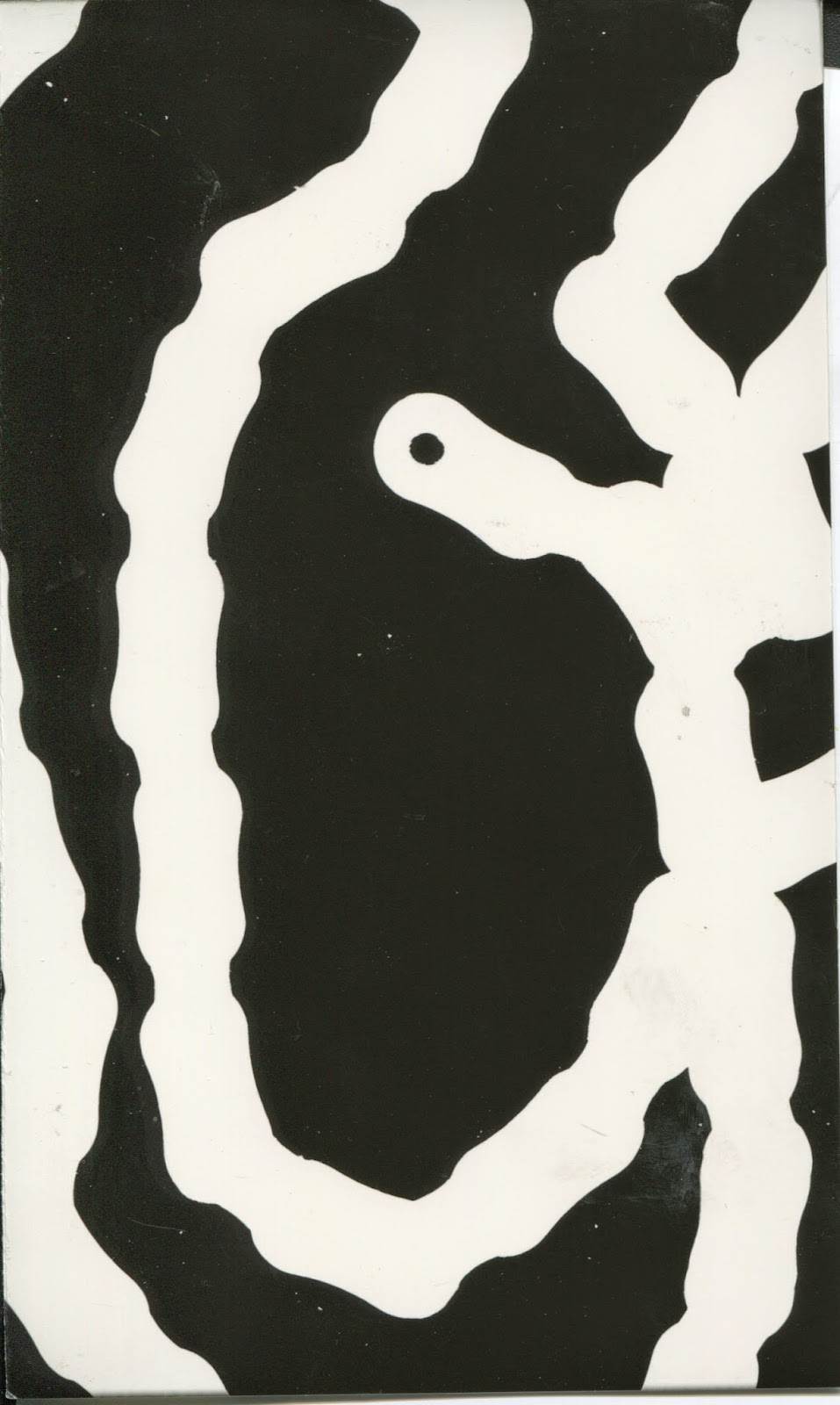
After looking it over and being told to focus on the key factors of music such as the Dissonance, Harmony, Discord, Rhythm, Theme, Composition, Progression etc etc. I set out to listening to a piece of music and drawing what I heard. At first I found this quite hard so instead of focusing to hard on a certain part of a song I just listened to the same piece over and over. For the first sketch I drew I just kept on layering and layering what I heard until I ended up with that you see below.


Having chosen to worked in charcoal this piece got very messy very fast, but that's something I found very fun. For all 3 piece I drew I was listening to - Supercell - Kimi no Shiranai Monogatari The reason why I chose this song, other then the fact I utterly love it. Is its a very strong and striking piece with a song piano lead throughout. For the fact it has a quiet start and over powering vocals, drums and piano at parts made it very fun to draw.
The piece above was made over the space of 45 minutes, listening to the track multiple times, layering up the different sounds I heard. From the swaying harmony of the quiet piano at the start, to the sharp structure of the drums. Overall i real love the amount of different marks I was about to create while making this first piece.

For the 2nd piece I was once again listening to Supercell - Kimi no Shiranai Monogatari but this time i wanted to focus on a certain part, for that I chose the piano and its repeated theme which is present throughout the song. Since It has a swaying spiral sort of feel I ended up having my hand flow in such a way I ended up with many a spiral on the page.


I really enjoy this piece, I'd say it is my favourite from the whole day for the fact I love the way the swaying motion is captured in a very dynamic way. I feel its strongly represents the way the piano was played, always leading up to something greater but keeping in tone with the rest of the song and instruments. Not to mention the overlay of marks from the charcoal work really well for this sort of piece.

Lastly I decided to move away from the charcoal which I have apparently become dependent on to make such amazing marks and to try my hand at watercolours.


Not my proudest piece to date as I feel I could still work into this A LOT more, but under the timing of the day this is what I ended up with. For this I was listening to the same piece again but focusing on the very start of the song. Where it starts with a very subtle and quiet piano and then all of a sudden explodes with sounds and emotions. For that I wanted to try and recreate the same sort of sounds with a very simple swaying form into a huge explosion of colour, For that fact i like this piece but I feel I could easily work into this with a lot more colour. I think using watercolour was the wrong median and I would have had a lot more success with acrylic paints. Overall I very much enjoyed this drawing to music and the results I ended up with. I cannot wait to take these forms and marks further into this brief.

3D Final Concept - Glass Work

After completing a set of Design sheets, my next step was to look back at these ideas and develop the ones I liked the most and what i thought would work the best into a final piece. At this stage I know i wanted to work in either clay or glass so I started to tailor my designs with one of those directions in mind.


In the end, I ended up with 5 designs I felt would work and while drawing these out I came to the conclusion i wanted to work with colour in my piece so inturn turned my mind to a more solid glass piece. So stopping with my final piece for the moment I went and did a quick test with a few glass layered glass pieces to see what sort of effect the end piece would look like.

I did this, as first i wanted to see what the coloured glass would look like when layered in between to clear pieces. The main reason for this was out of my final designed I really like my bottom left piece. Which didn't just include crushed glass and clear, but also wire to help with the forming of a coloured pattern. After solidifying my idea, I went back to the Glass room and started on collecting the scrap glass I needed to work on this piece.


I decided instead of adding a mould to curve my piece, I'd just leave the piece flat. This was mainly down to the fact I didn't want the crush glass to have a chance to move even if just a little bit, for the fact the design could be lost if that happened.
As well as that, i decided on using bits of cut glass leaving space between each for the top layered, instead of one solid piece which i used in my test. I wanted to try this out as I feel it would give a more ridged effect to my piece making it more interesting to look at. This come into my mind when I was thinking whether or not I could set the piece on a mould.


Not the best photo, but this is my final piece after spending its time being in the kiln and I am very happy with the way it came out. The glass on the top most layer moved a little bit from being perfectly straight with the back piece but I much prefer this effect as It gives the piece more characteristics which I didn't even think to give it. I really like the way the shattered glass isn't the same in each space too. I think this will be down to not being anal about putting in the exactly same amount into each space. Overall I am very happy with this piece and have learnt a lot while working with glass. I know it will be hard to try and recreate this effect as well there are a lot of variables working in glass but that adds to its charm I think. I'll definitely come back to glass work again later down the line and try out some more experiments and tests.