From my cliches i took the word 'Honesty' and then played around with manipulating that word further with various Illustrator techniques.

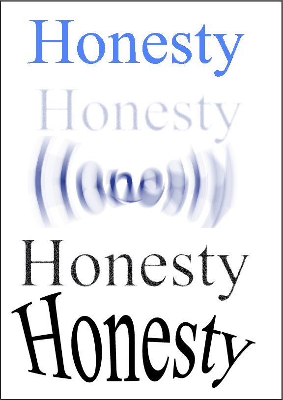

First things first in Illustrator I first off used the type tool to write the word 'Honesty' and then went onto effects and then adding different filters as you can see by the first photos. I played around with such effects as Cutout [being the first image], Radial Blur [3rd image], Warp Bulge [Last image]. I really like the effect you can get out of the last image on the first photos [Warp: Bulge] as you have a lot of ability to turn the letters in whichever way you like.
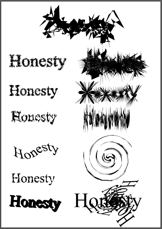
In the 2nd photo i started to manipulate my word by using the transforms effect. This is an effect i really enjoy as you can get some many different and unique effects just by playing with the angel setting alone. Couple that with the different scales and movements you have with the horizontal and vertical you have a wide array of different effects. So i took my hand to creating spiral effects which I think turned out very well however i found it very time consuming to get the desired effect I wanted but now i have the settings i can go back anytime to recreate it.
Next I experimented further with some of the other distort and transform effects and this is where i found some i really loved. In order Roughen, Pucker & Bloat, Tweak, Twist and then finally another 3D and another transform. I didn't really enjoy the 3D effect as it seemed a little to clunky to get to work as depending on the font it can block out some of the letter form. I mostly enjoy the randomness of the Roughen and Plucker & Bloat effects, I like how just when only slightly added it gives a fuzz/buzz effect and when cranked all the way up it gives such a detailed explosion of lines and shapes.
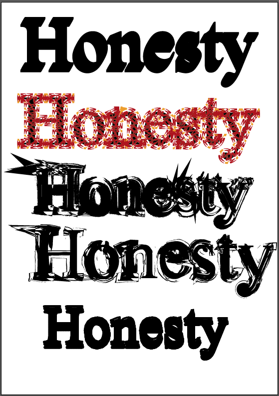
The second last thing I experimented with in Illustrator was adding brushes to the outline of text which can be seen on my final photo. This was a very tricky process as a lot of the brushes added effects that overlaid the text in such a was made the word unreadable which is an effect i wasn't aiming for this time.
Lastly in Illustration my aim was to manipulate my words which had a artistic brush added to it further by adding symbols. For the symbols used in my image above are from the grime vector pack and dot pattern vector pack. I really love the ink feel from the grime pack as it works well with the artist brush added onto the image, it gives the image a lot more depth and wild feel. As well as that the drip symbols help make the word feel a lot more alive as if its really been drawn.
No comments:
Post a Comment