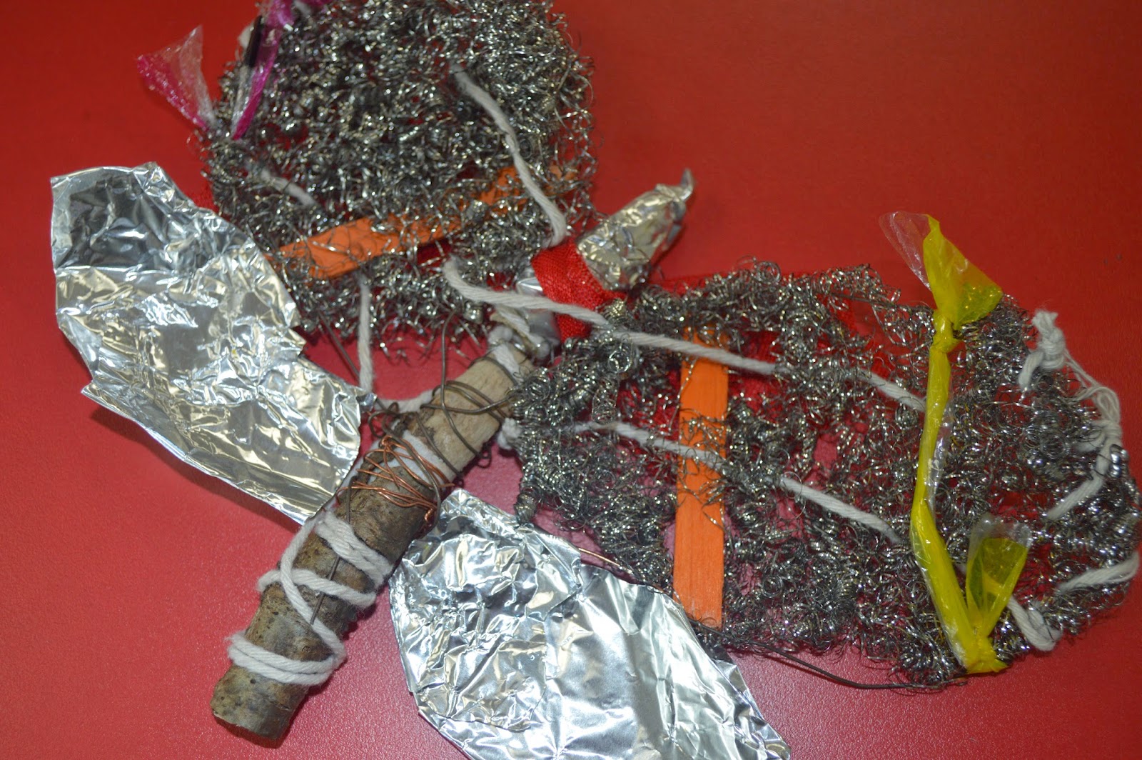


First off I'll comment on the time, we were given 30 minutes and for this first drawing i definitely took on more then i first thought was possible. I spent to much time trying to get the details of the string and plastics to have some impact through the steel wire that i didn't have time to even attempt the 2nd wing but for the amount i did complete i really like. Charcoal is a very messy material to use but once you get into the shading you can make some really interesting things happen, for example i think it really help make the string pop over the steel wire to give the image a lot of depth.
Next we did another 30 minutes drawing with the same material and concept but this time to try using just lines and less shading.

This time i went for the same sort of angled birds eye view but from the bottom section of my moth and i really like the way this piece turned out. Once again we had 30 minutes but i feel i managed that time a lot better and was able to get some really good detail from the line work on the wooden end. As well as focusing on the bold string and wire work around the wood centerpiece.
Next onto the real mess. Indian ink time!


Now this is something i really enjoyed. I used very simple tools, White A2 Paper, Indian Ink Black and a Coffee stirrer, Yes one of those, one end was cut at a 45 degree angel to cause a very fine line when used with the ink and then the other end left as was in a circular shape which worked very well for thicker lines.
With this drawing i decided to focus on the top again but concentrate it more on the upper right then just the whole top to help cut out the problem of time issues and i went in and it sure got messy fast but was very interesting to determine how much ink i need to apply each time to get the same effect i just made. For example with the wings i was trying to make a crisscross sort of effect but instead of just tapping away i changed my stroke to make the lines thicker in other places to attempt to add more depth within them. I think it worked well for a first try. The one thing i couldn't get to work in my favour was the string, i couldn't get it to pop as i added to much ink to the wing and didn't fade it out well enough. I'd definitely go back and try that different next time.
No comments:
Post a Comment